


The Color Of Comfort
FitFlopが提案する
「The Color of Comfort(快適さの色彩)」。
それは、色が私たちの気分や動きに
どのような影響を与えるのかを、
「Pantone」とともに探求する
新たなコラボレーションです。
色彩科学に基づいた
それぞれのデザインは、
単なる見た目の美しさだけでなく、
履いたときの心地よさまで
計算し尽くされています。
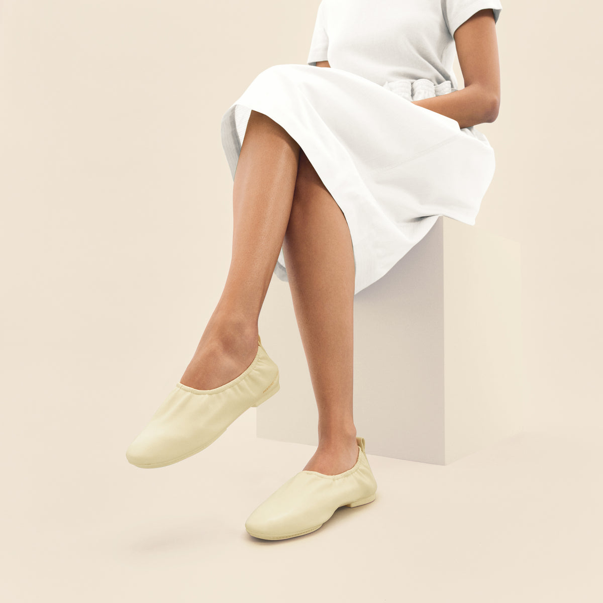
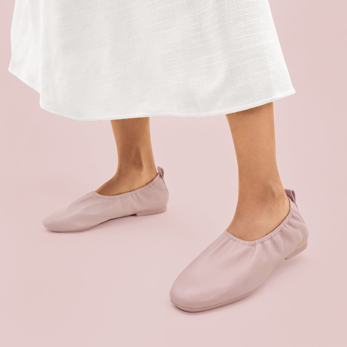
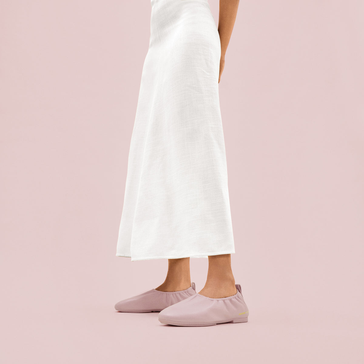
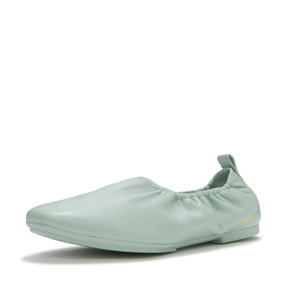
本コレクションでは、
日々の気分を明るく彩り、
軽やかさと自然な動きをもたらすよう
厳選されたパステルカラーを
採用しました。
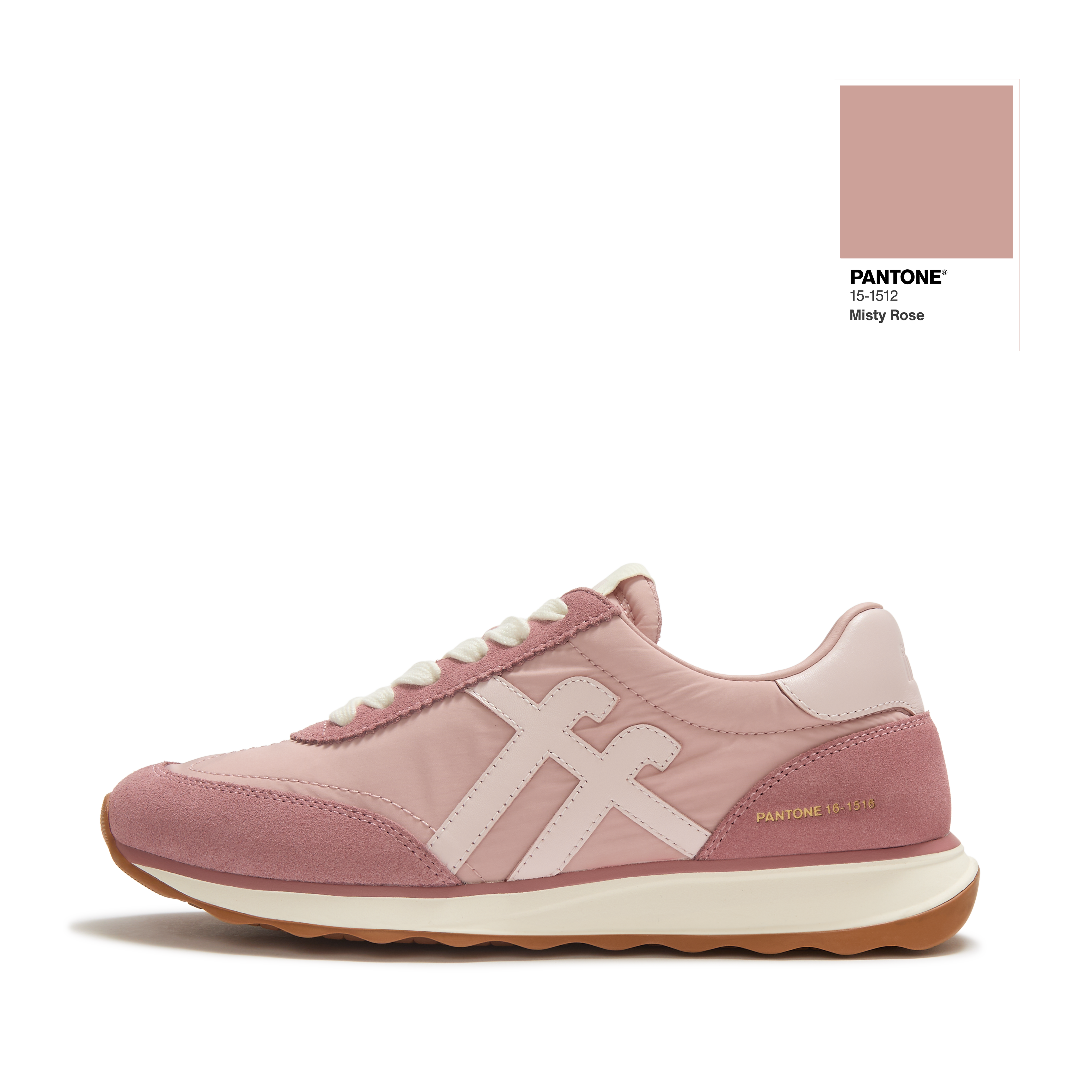
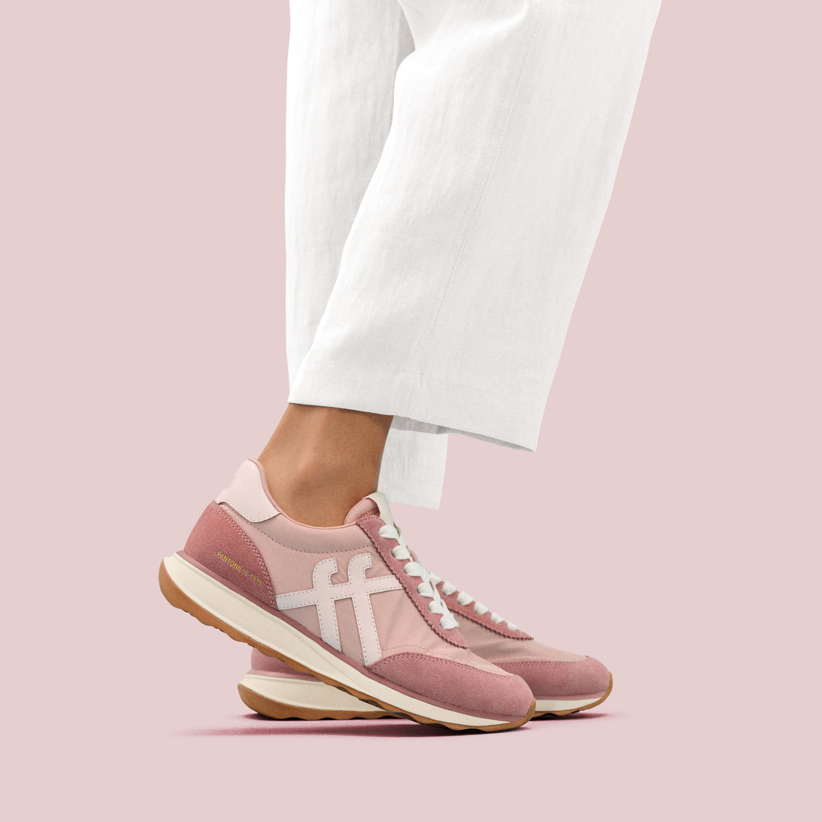
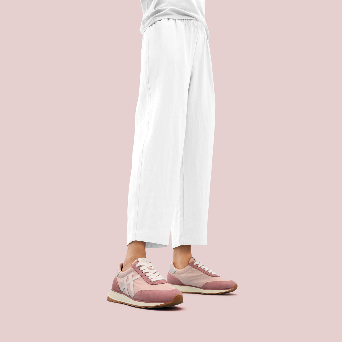
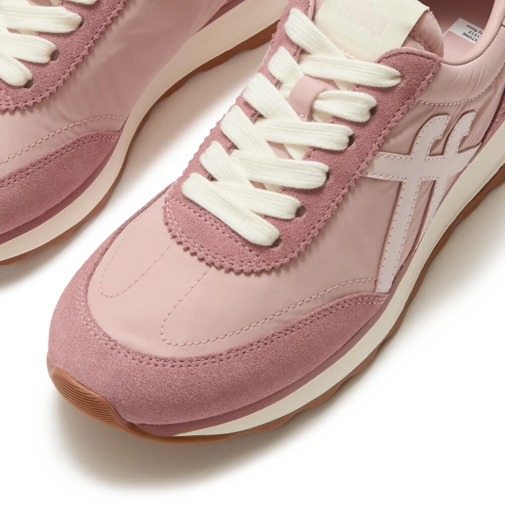
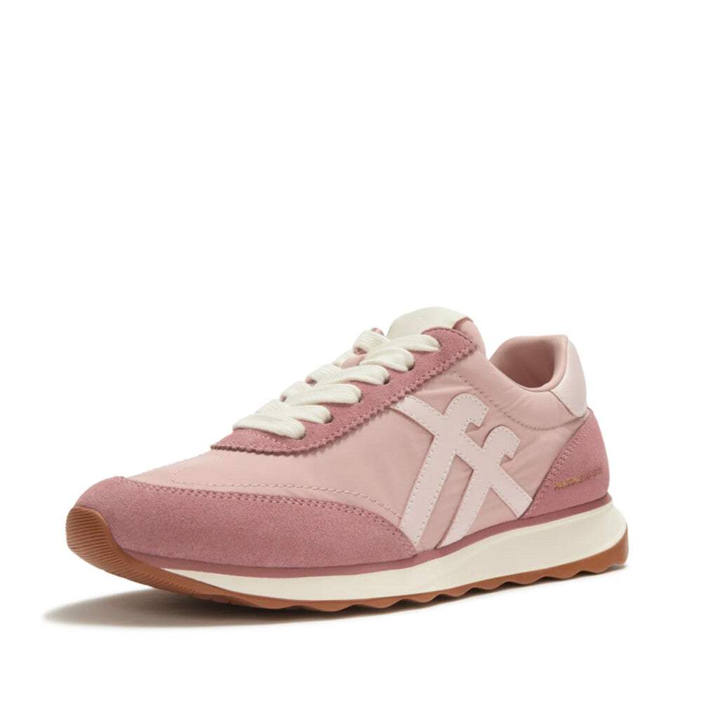
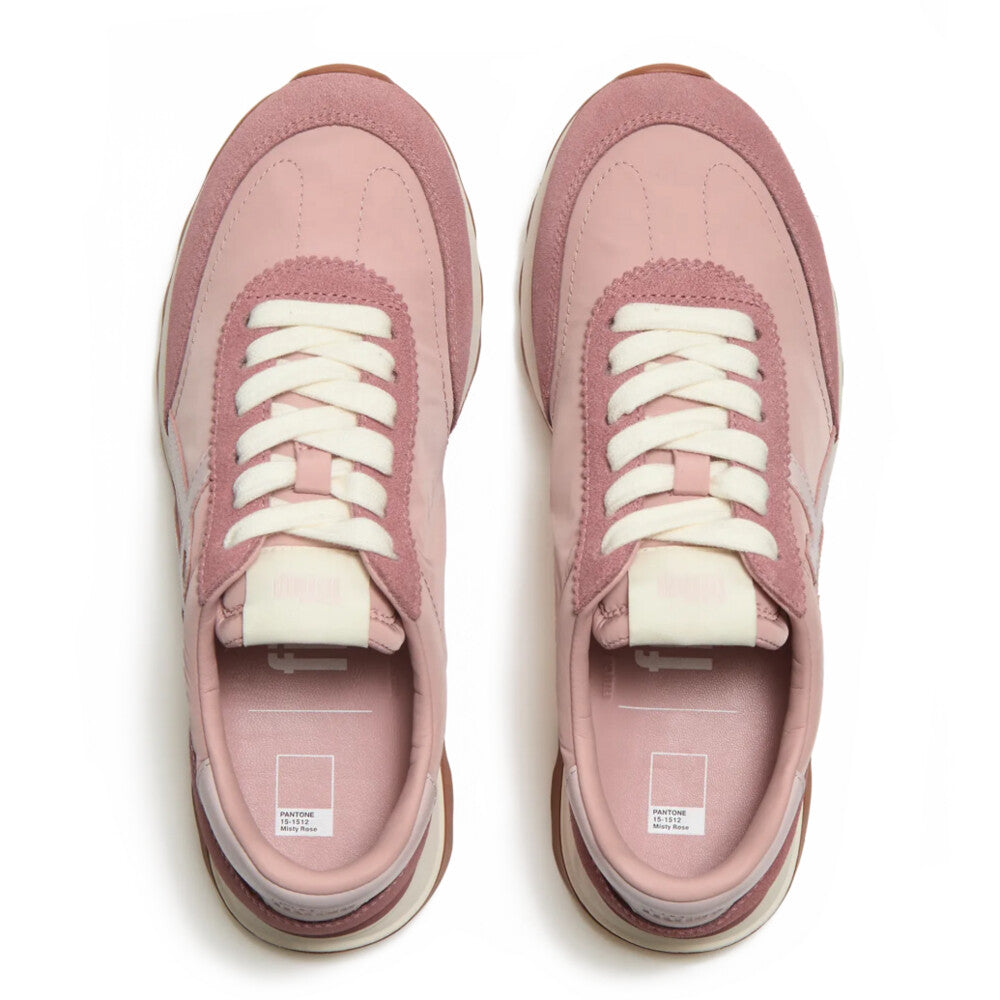
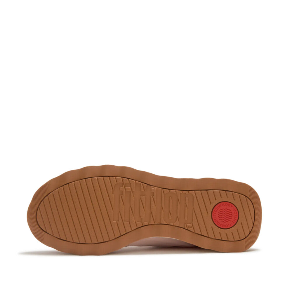
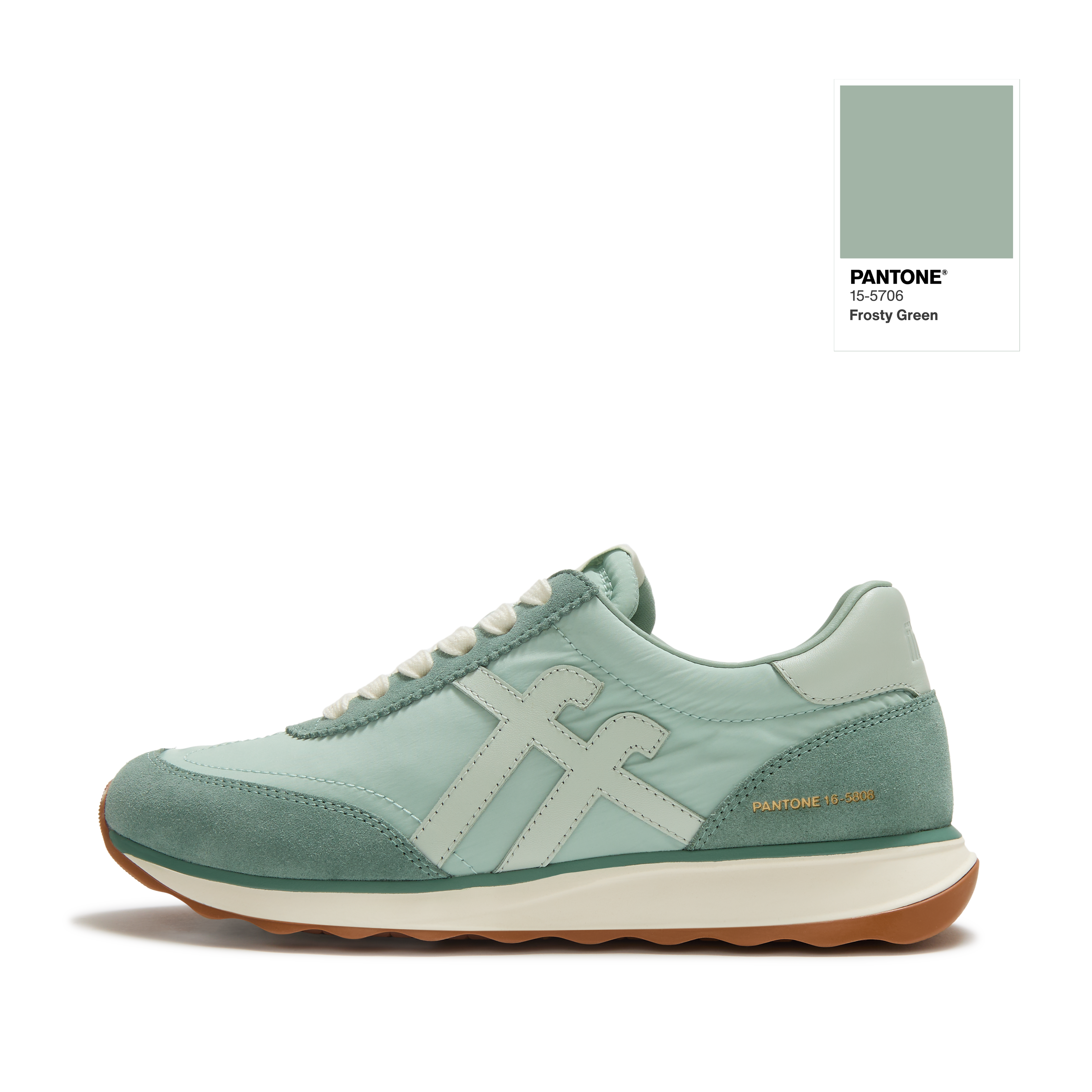
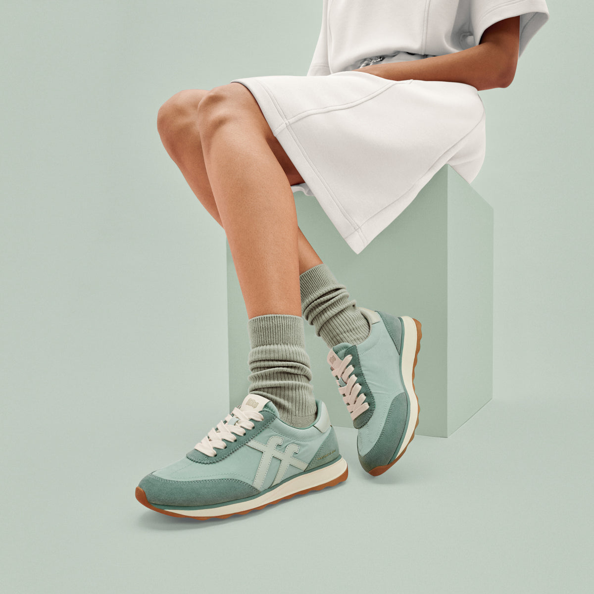
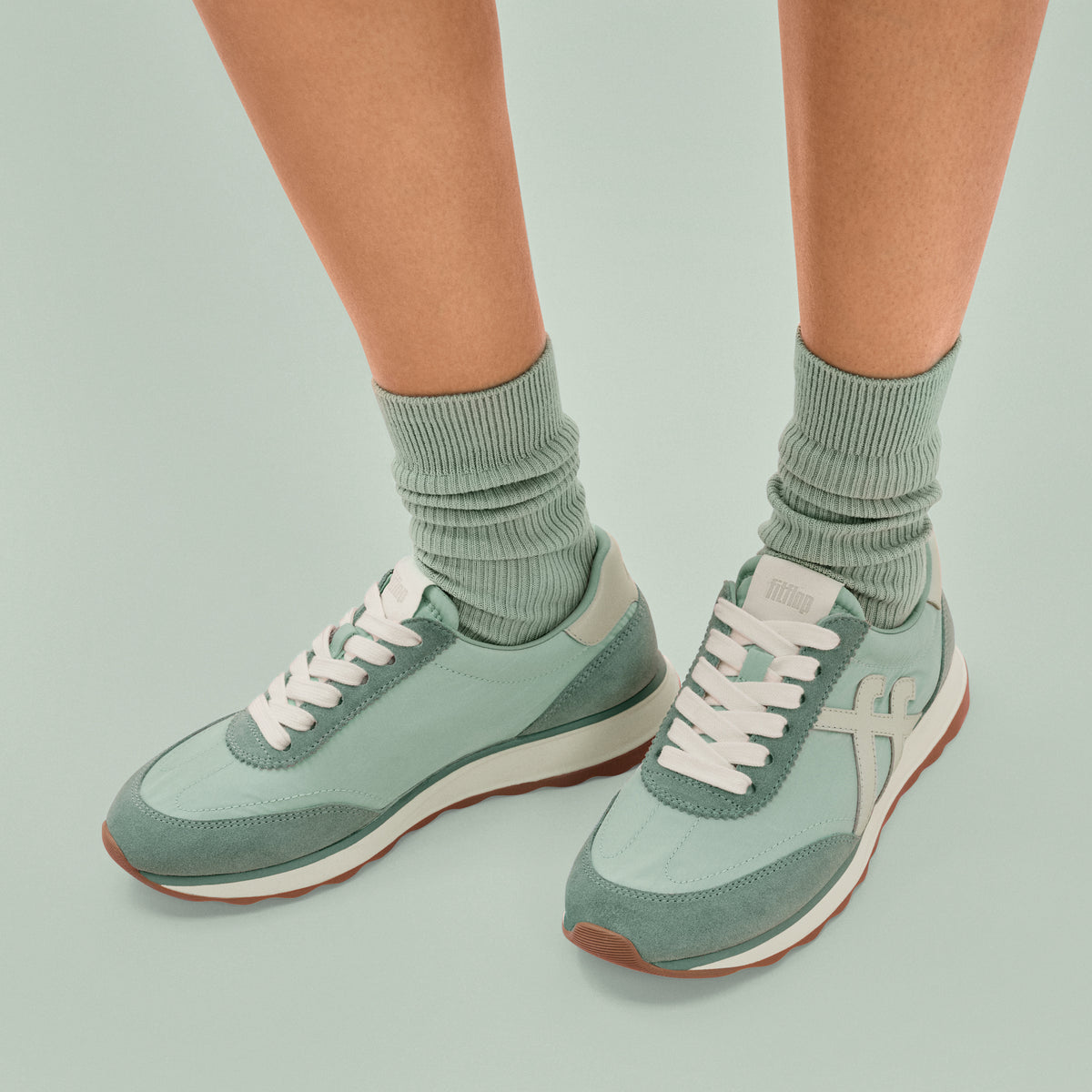
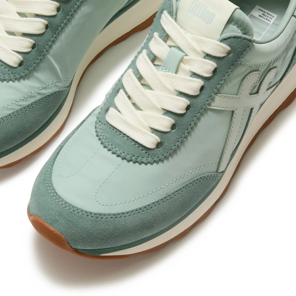
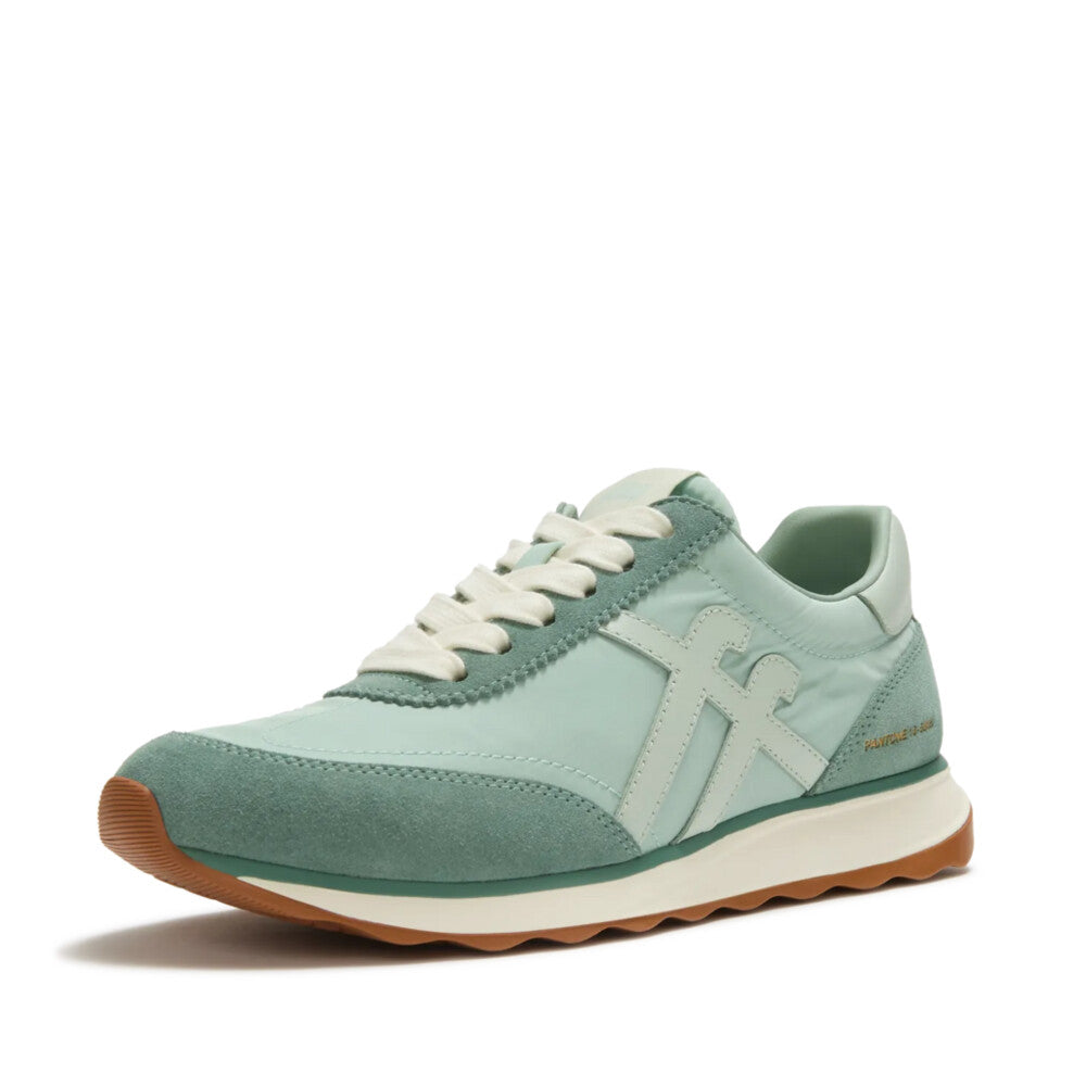
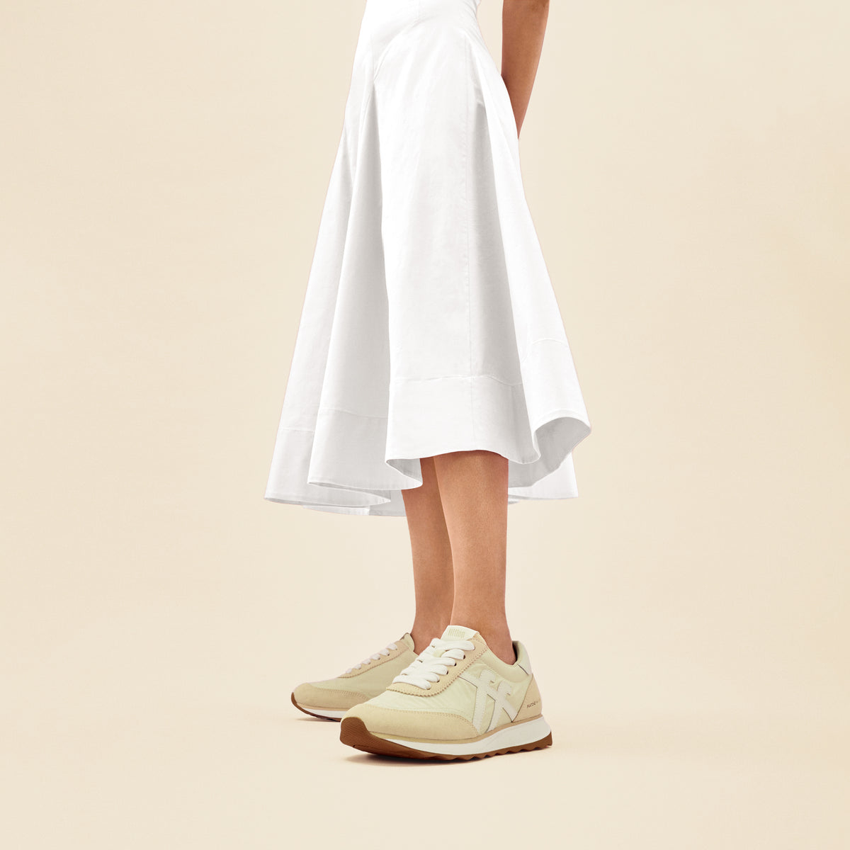
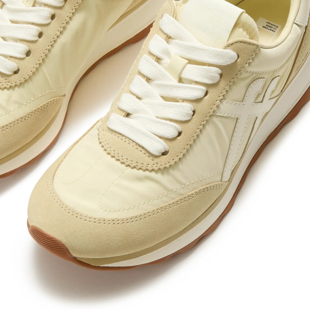
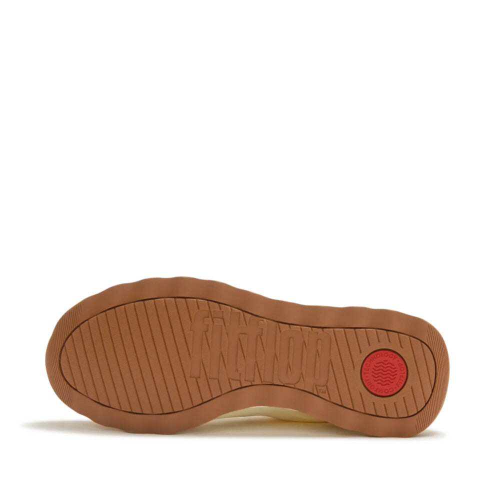
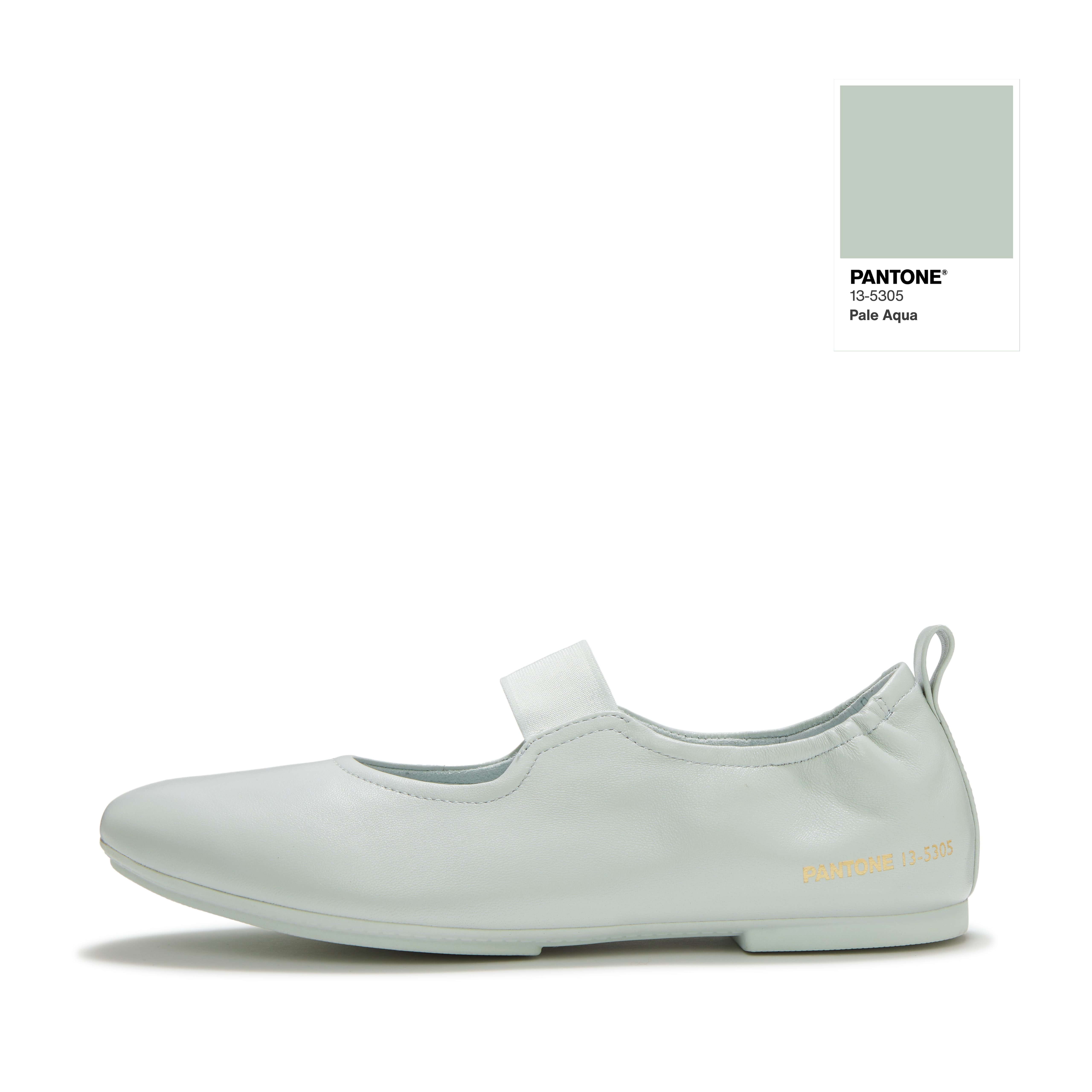
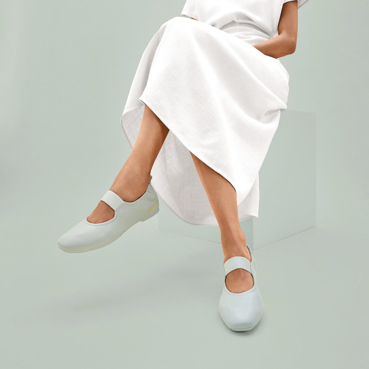
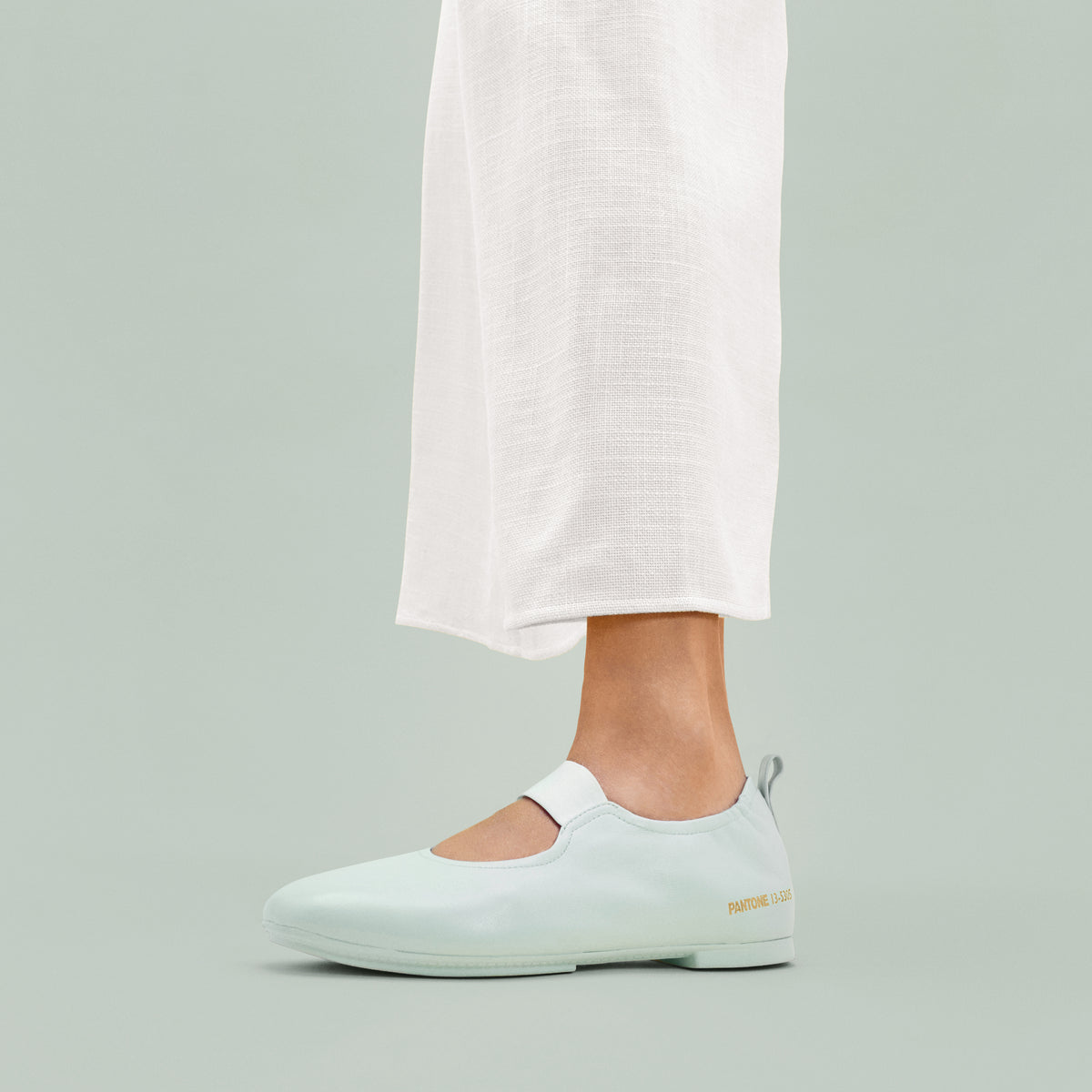
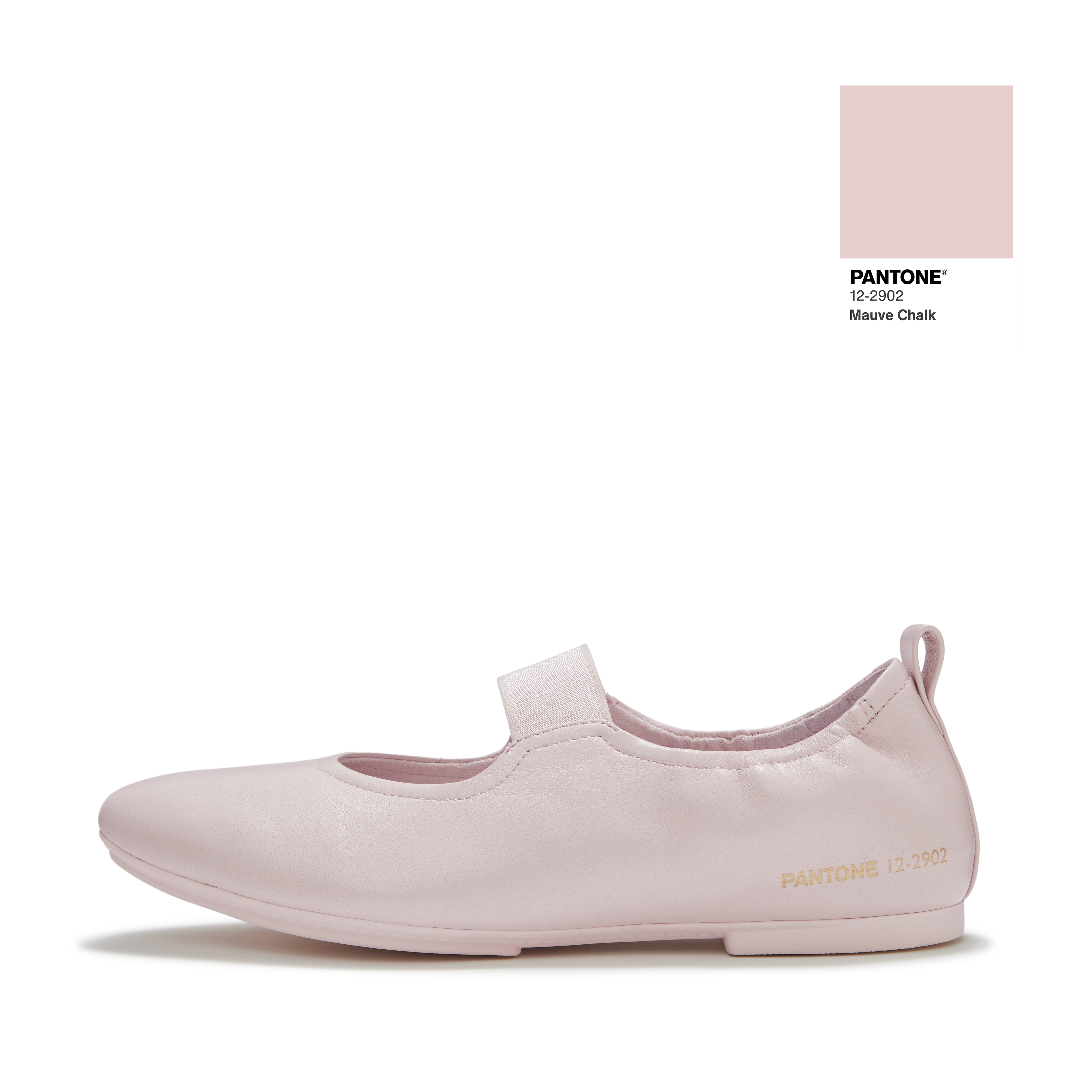
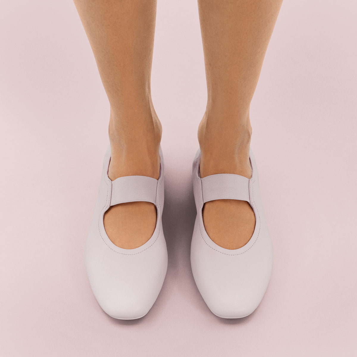
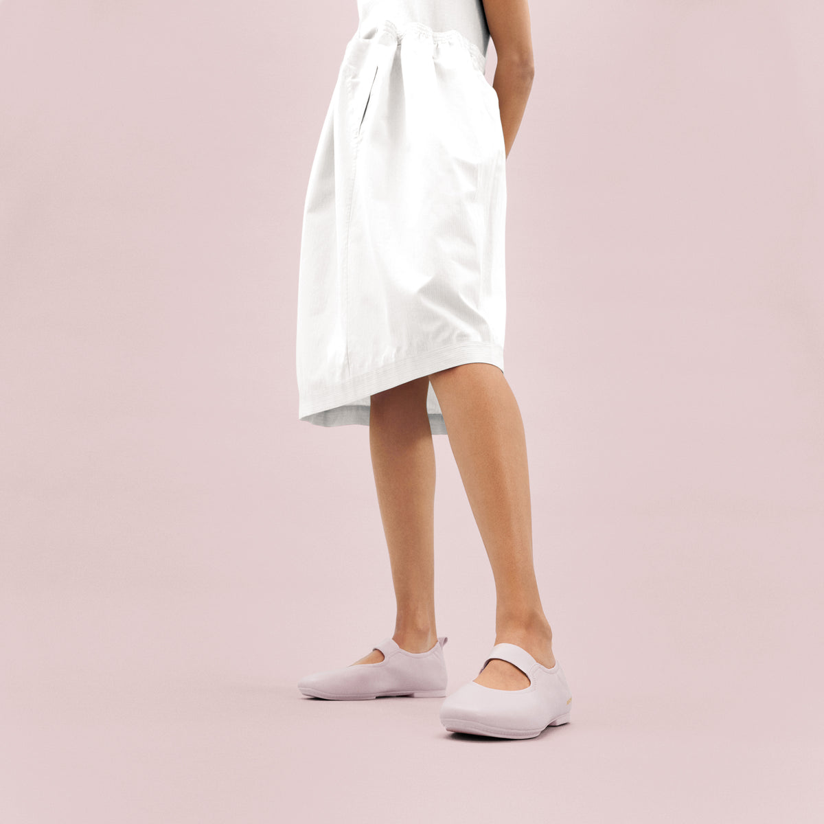
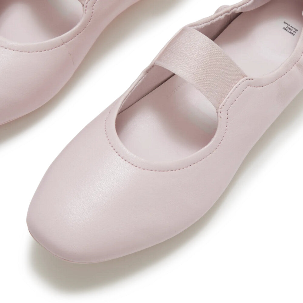
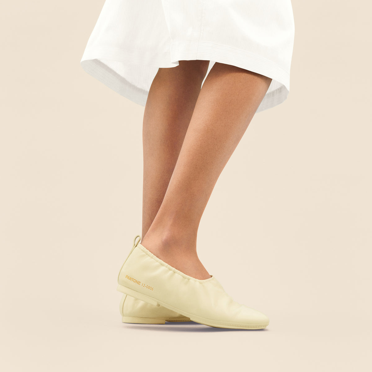
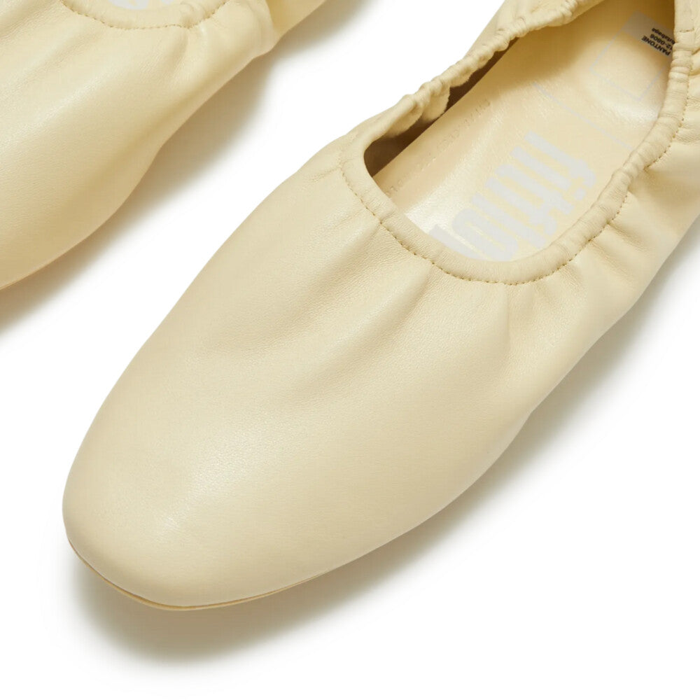
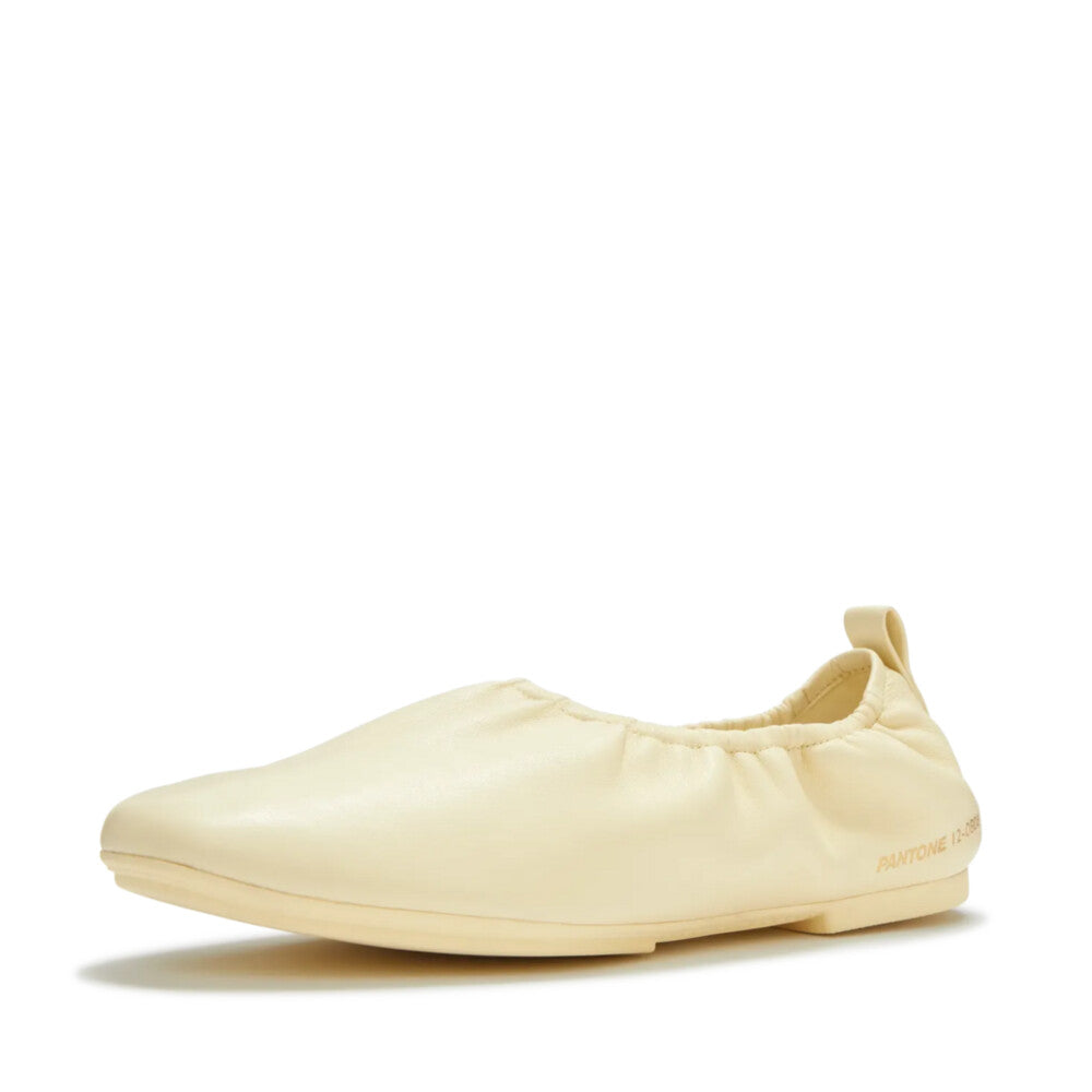
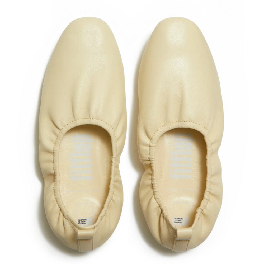
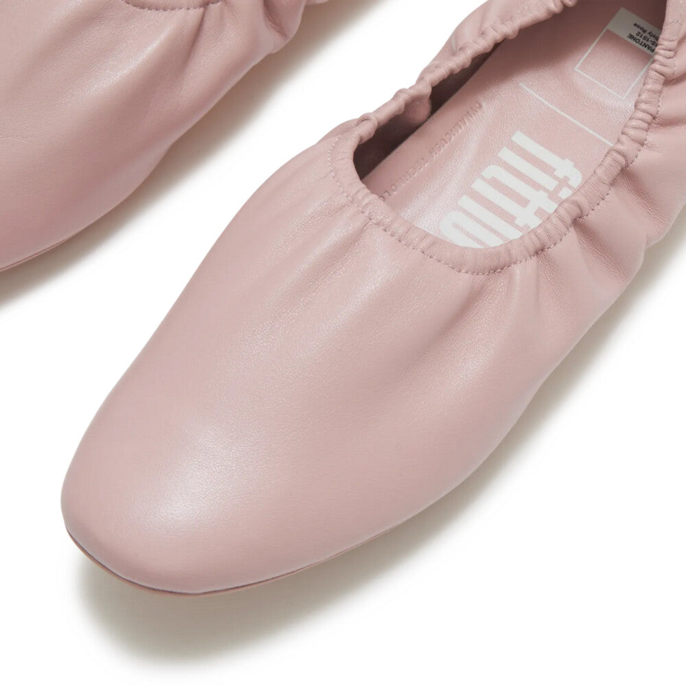
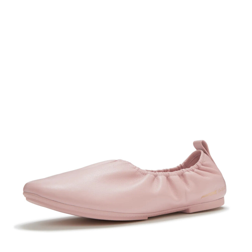
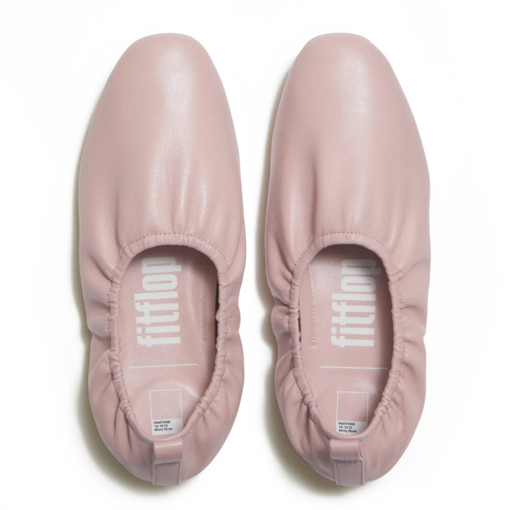
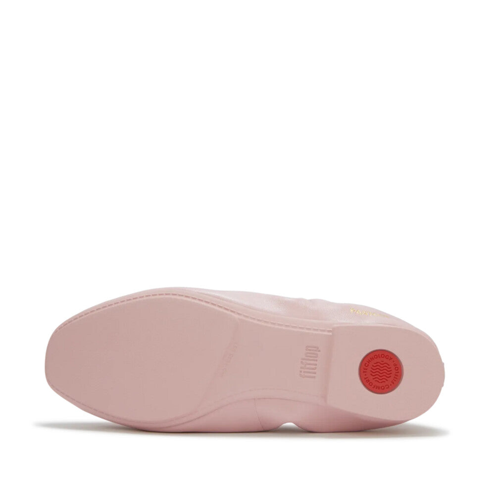
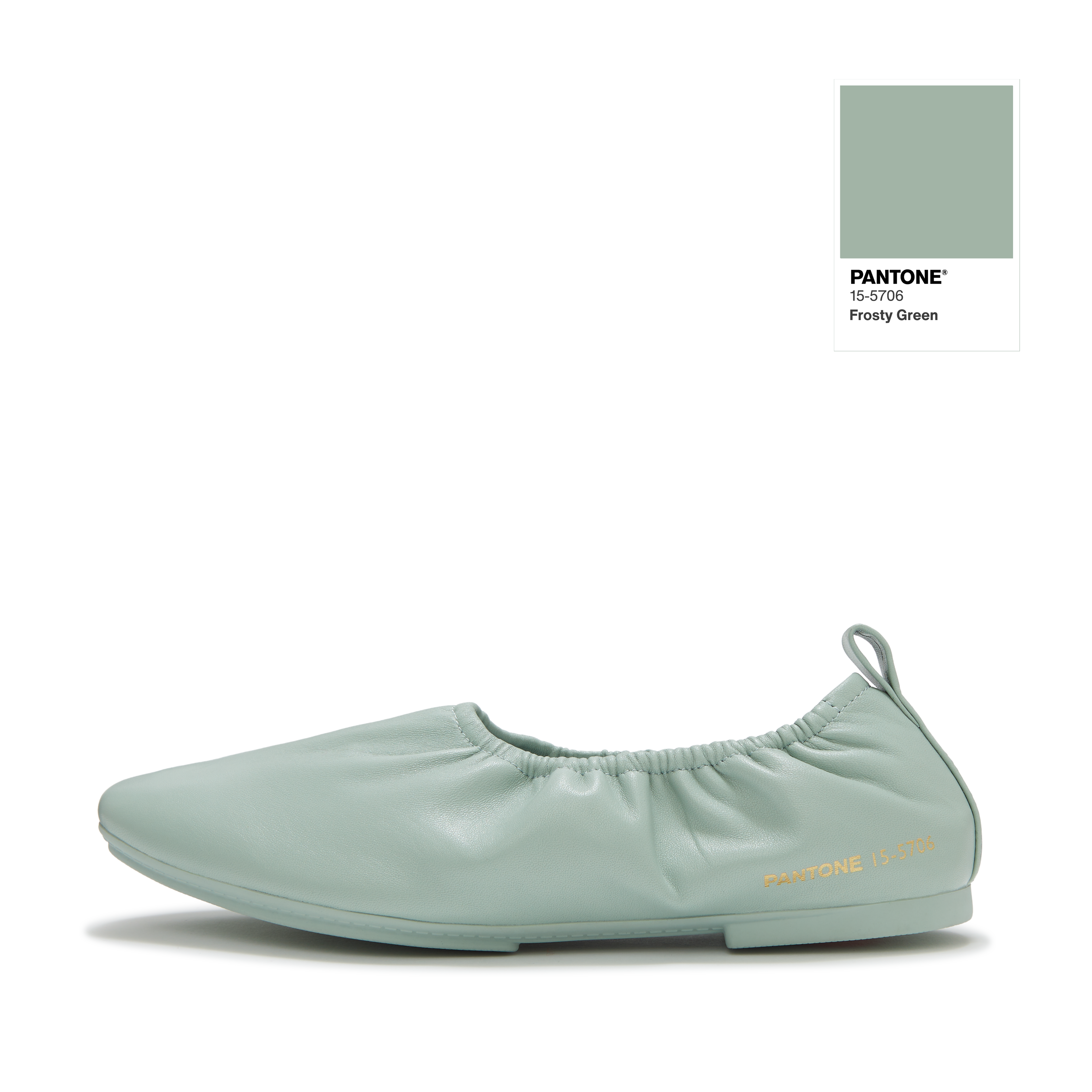
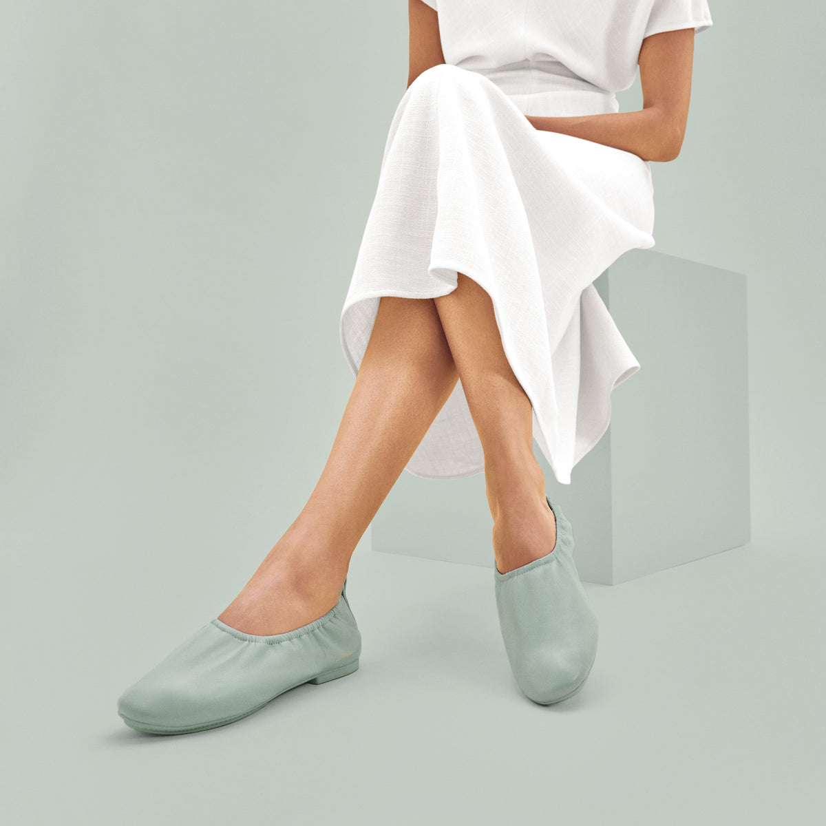
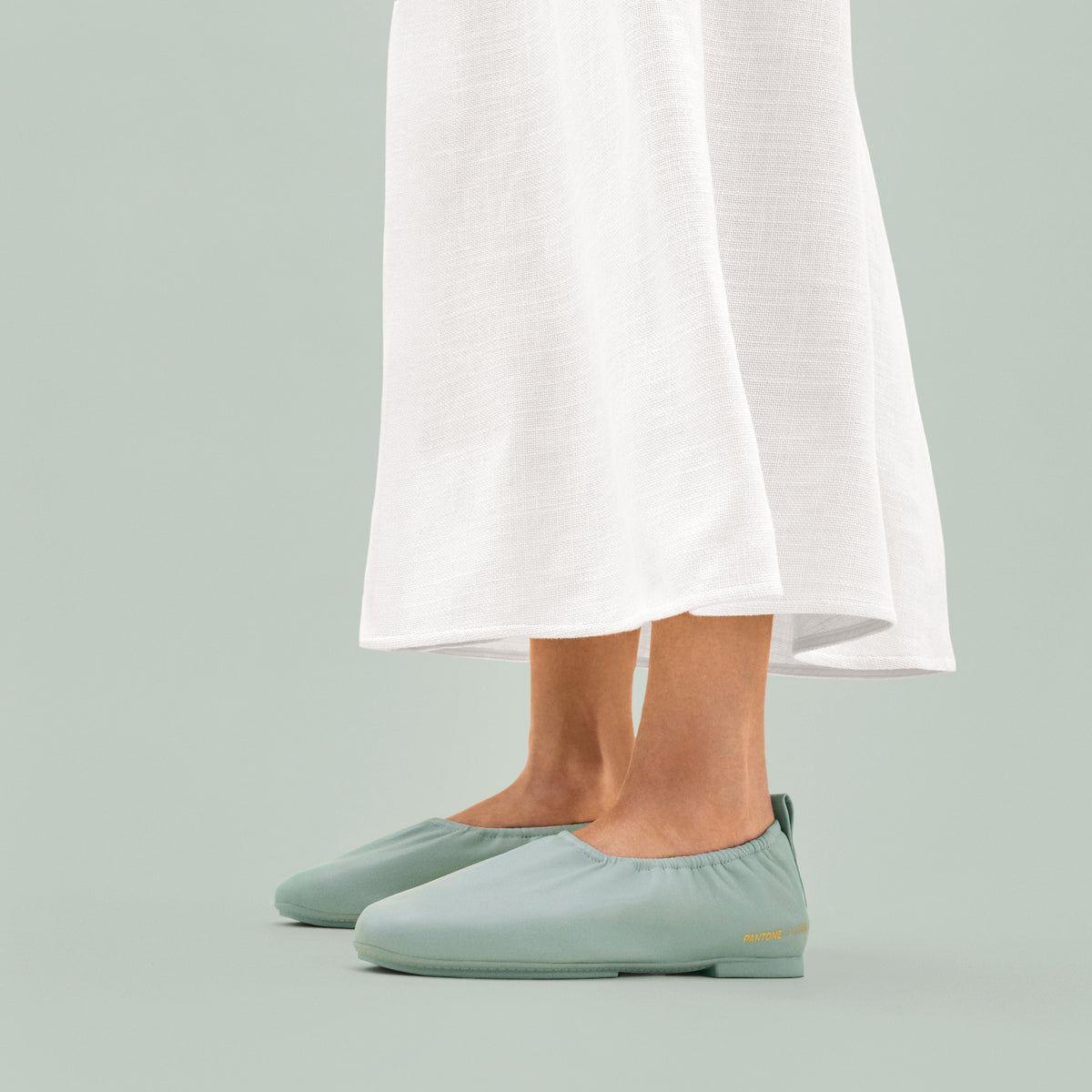
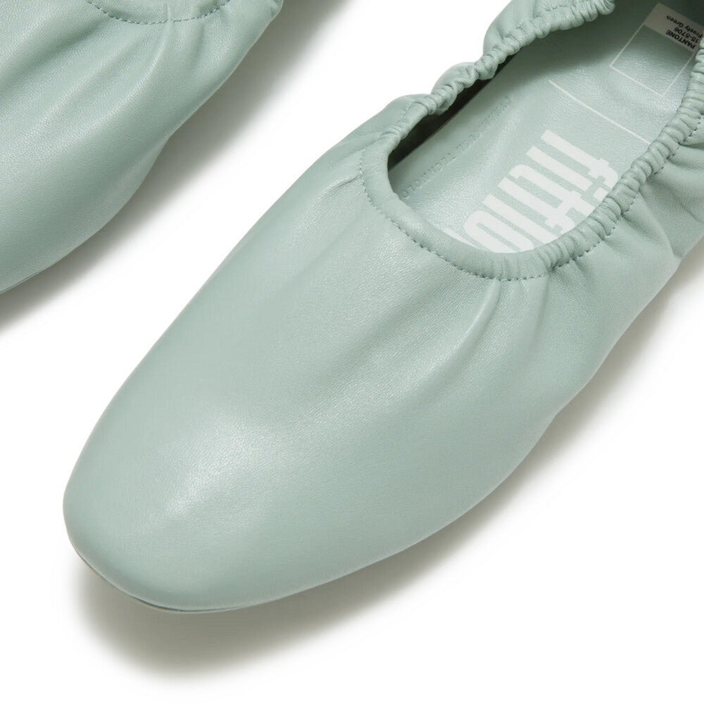
The Language Of Colour
Pantoneは数十年間にわたり、
デザイン、ファッション、
カルチャーの領域において
色彩の解釈を定義し、
世界共通の「色の言語」で
あり続けてきました。
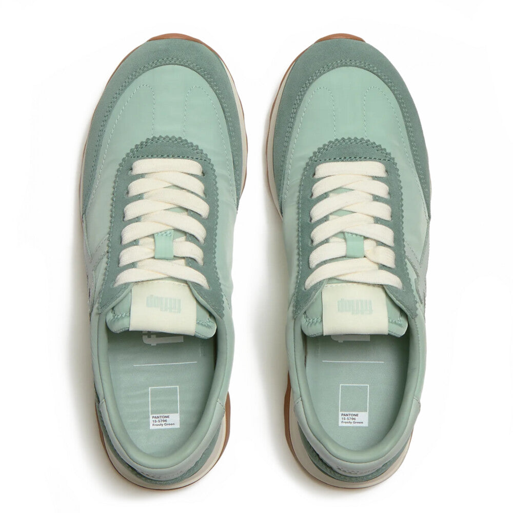
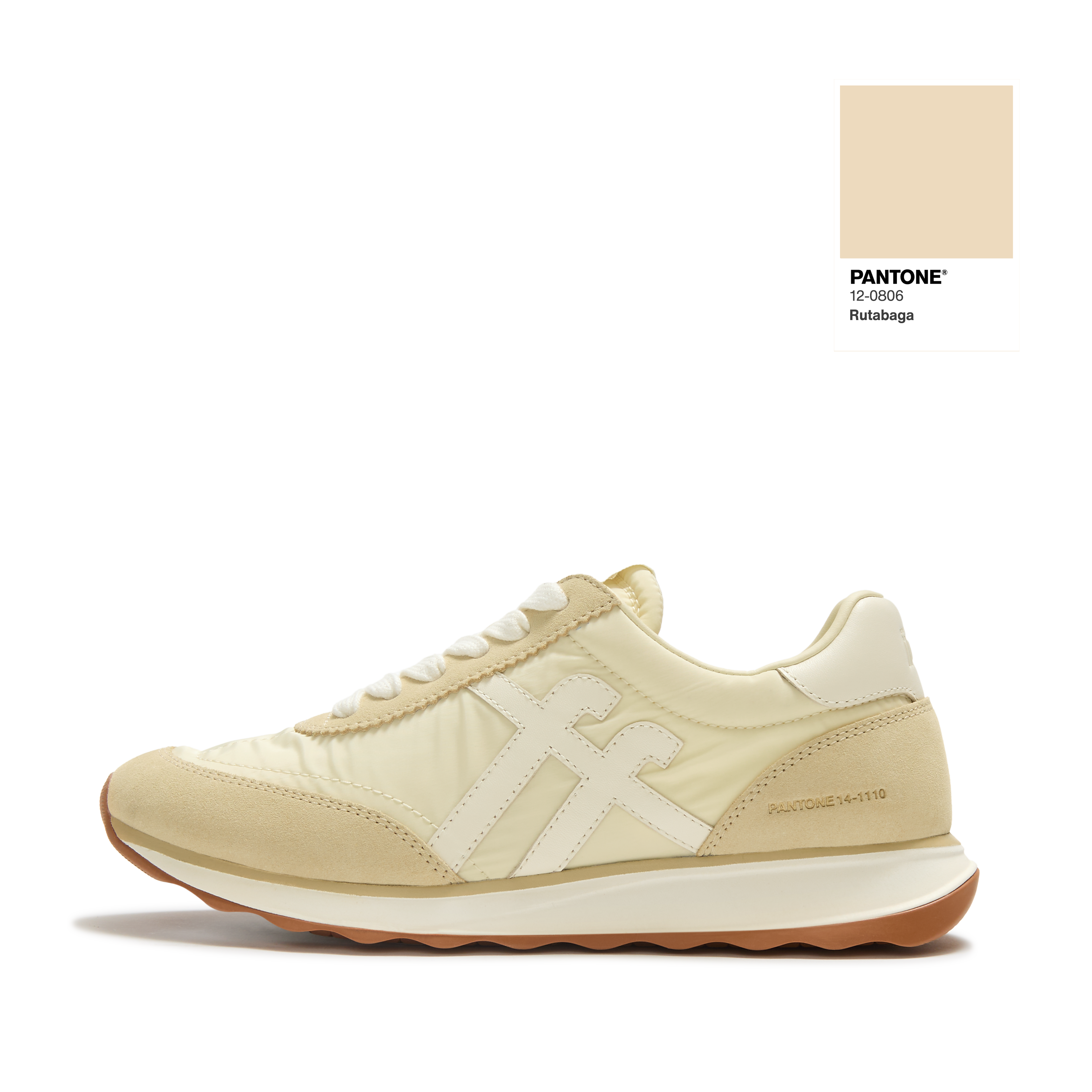
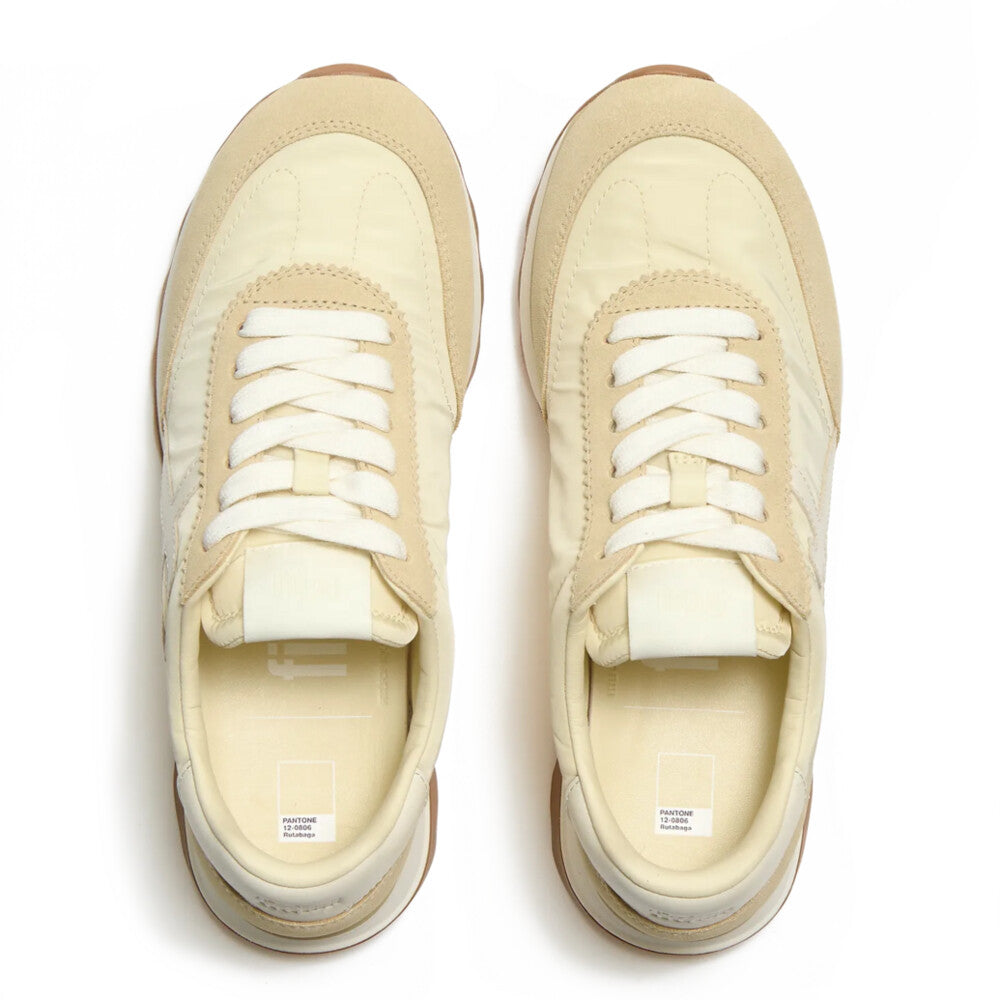
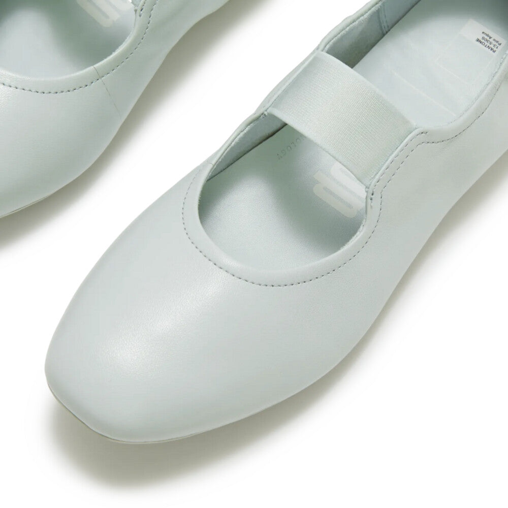
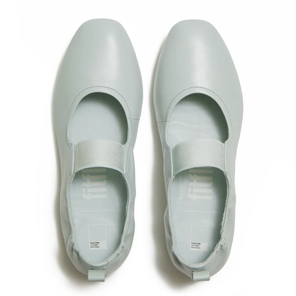
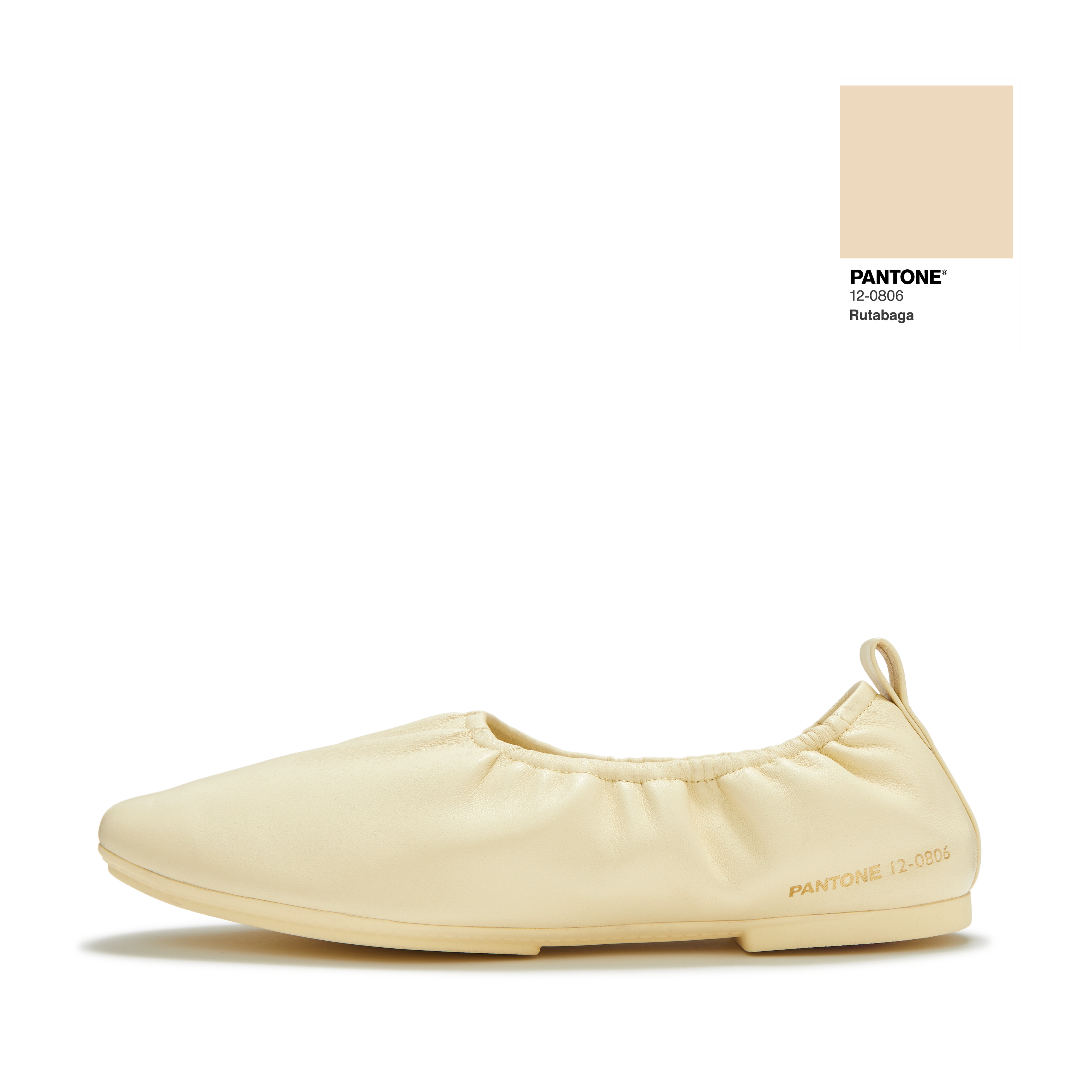
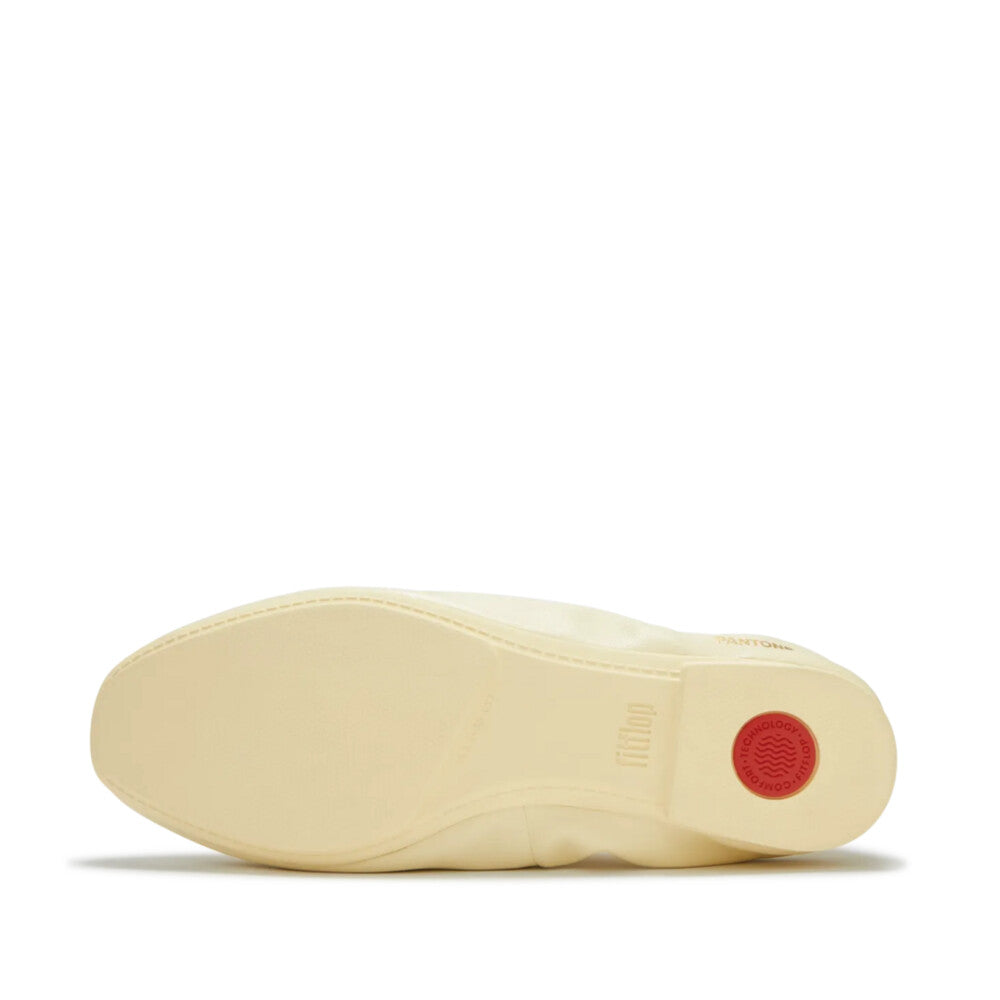
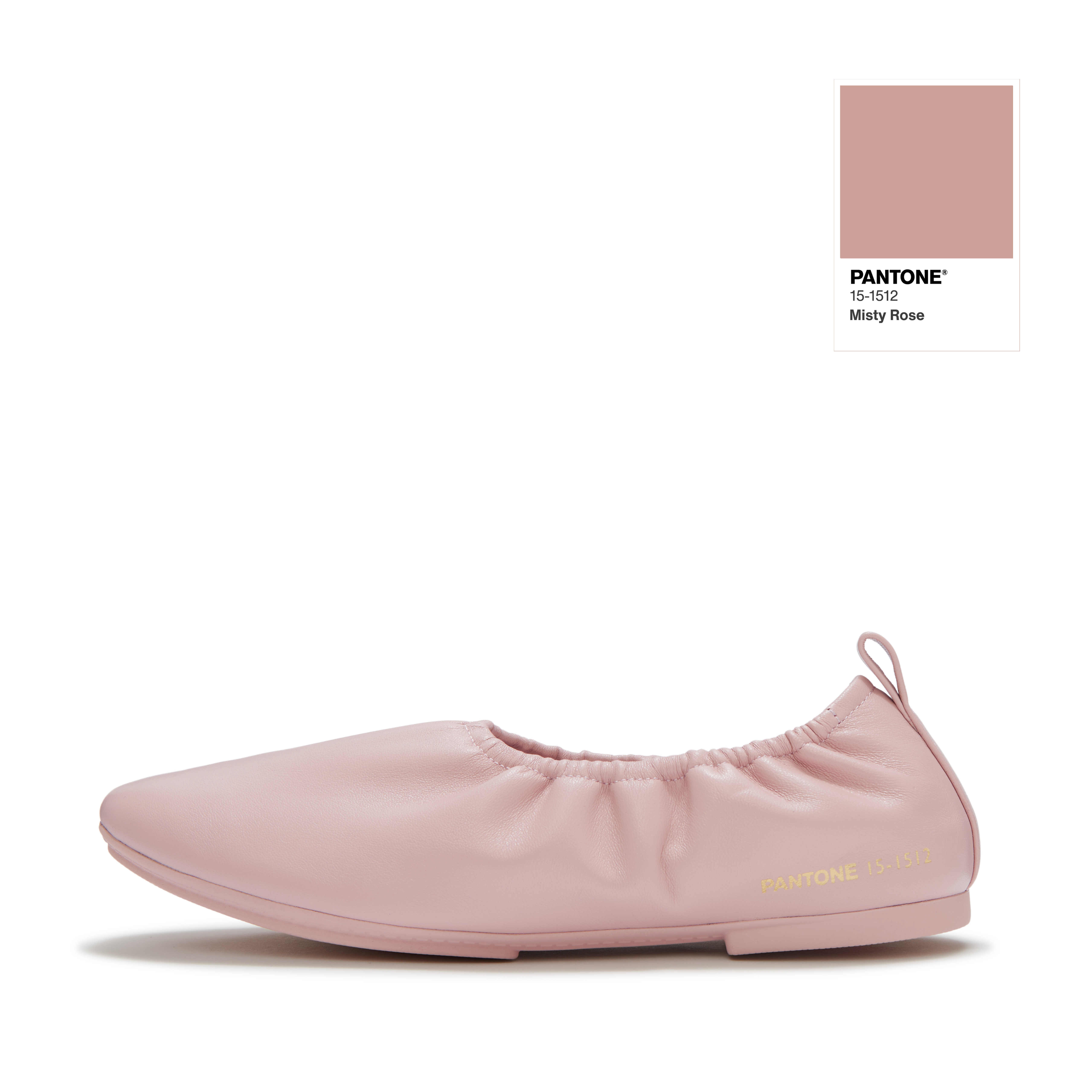
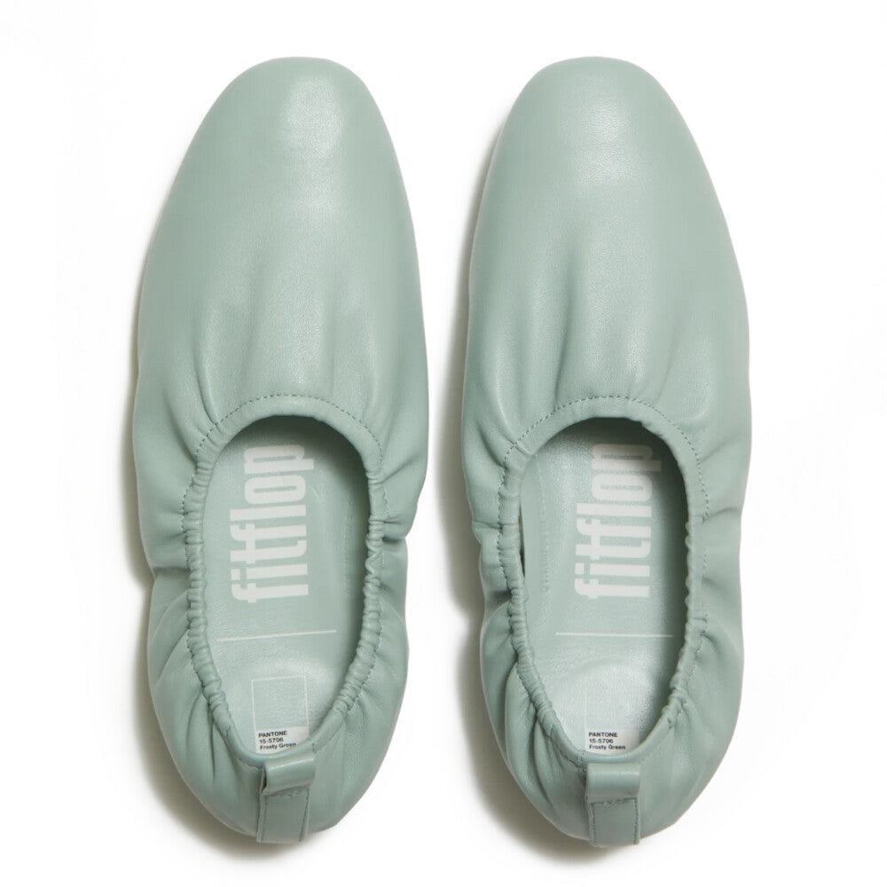
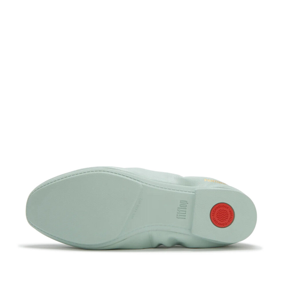
Pantoneならではのディテールとして、
今回のコレクションには
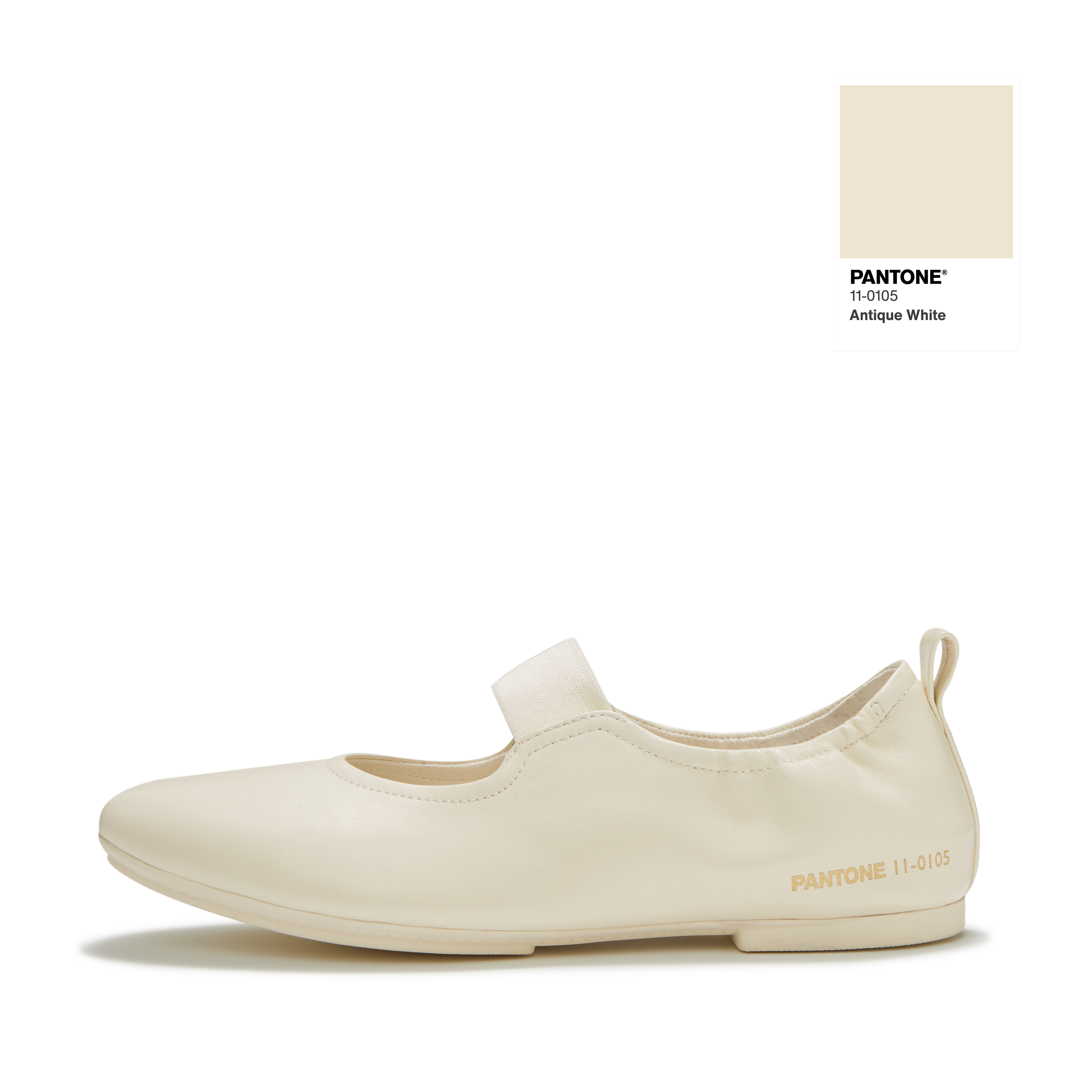
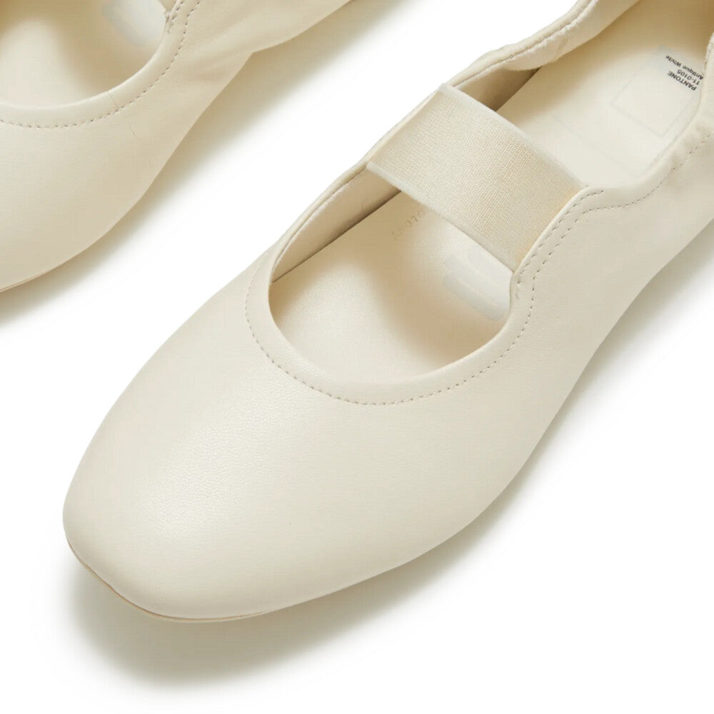
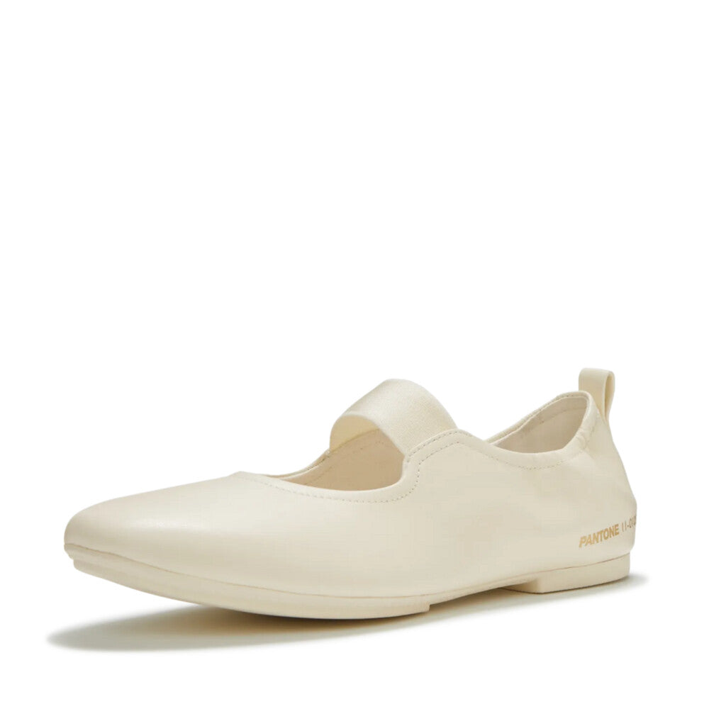
カラーチップ(色見本)を
イメージしたアクセントや
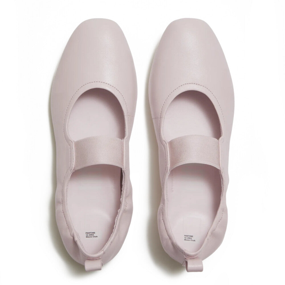
精密なカラーID刻印が施され、
色を単に「見るもの」から
「五感で感じられる体験」へと
昇華させています。

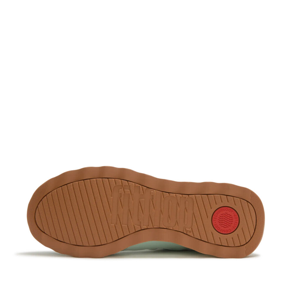
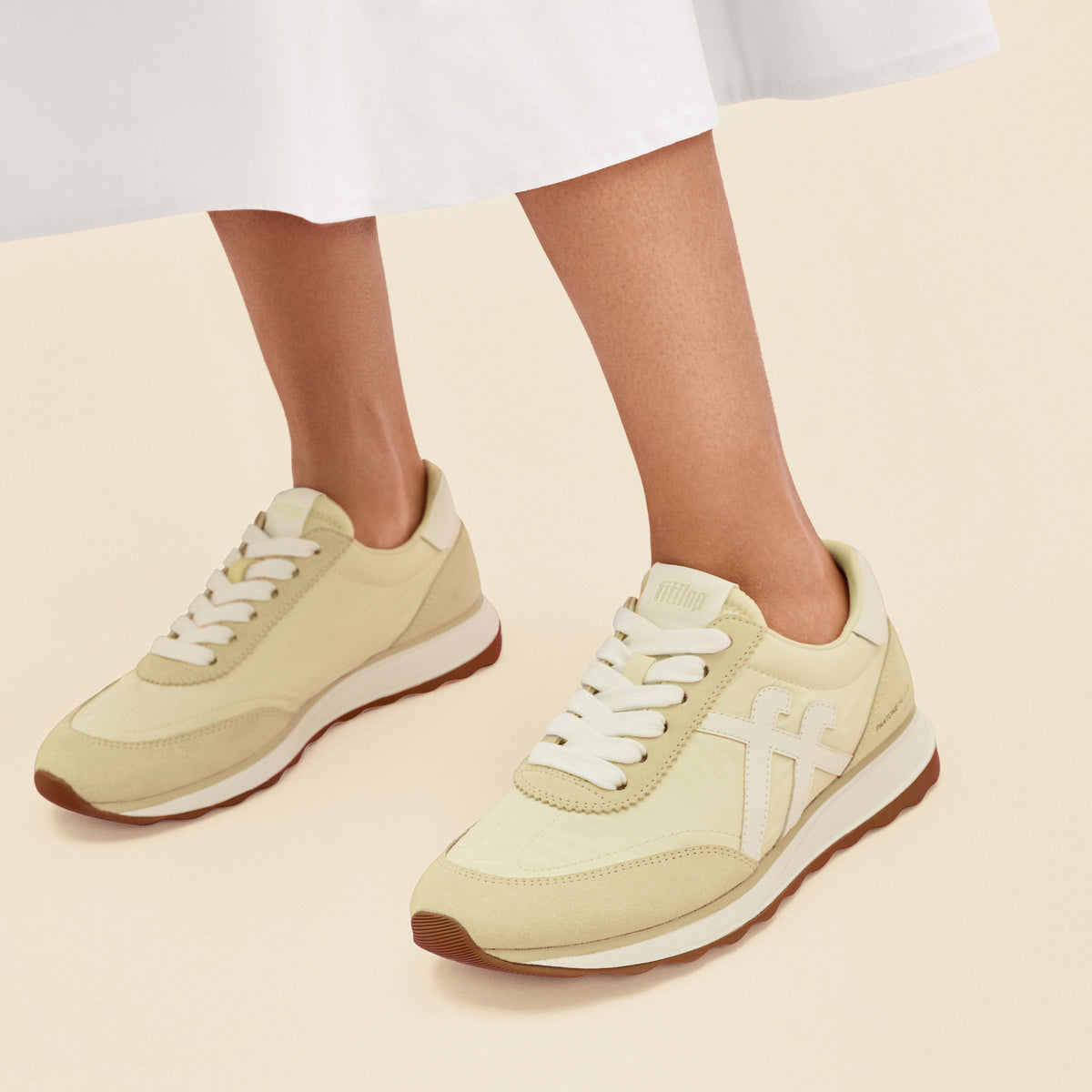
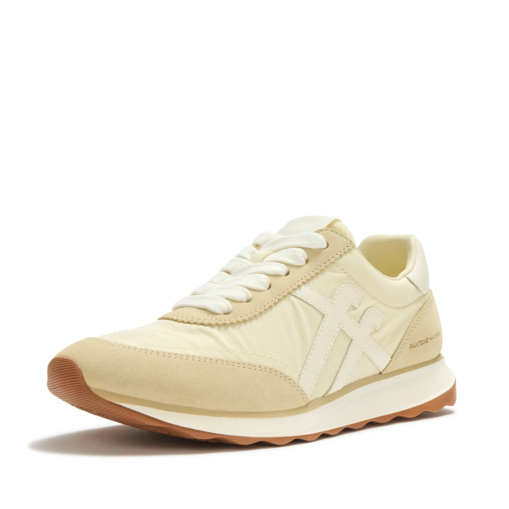
【FitFlop × Pantone】RETRO-Q SNEAKER - PANTONE

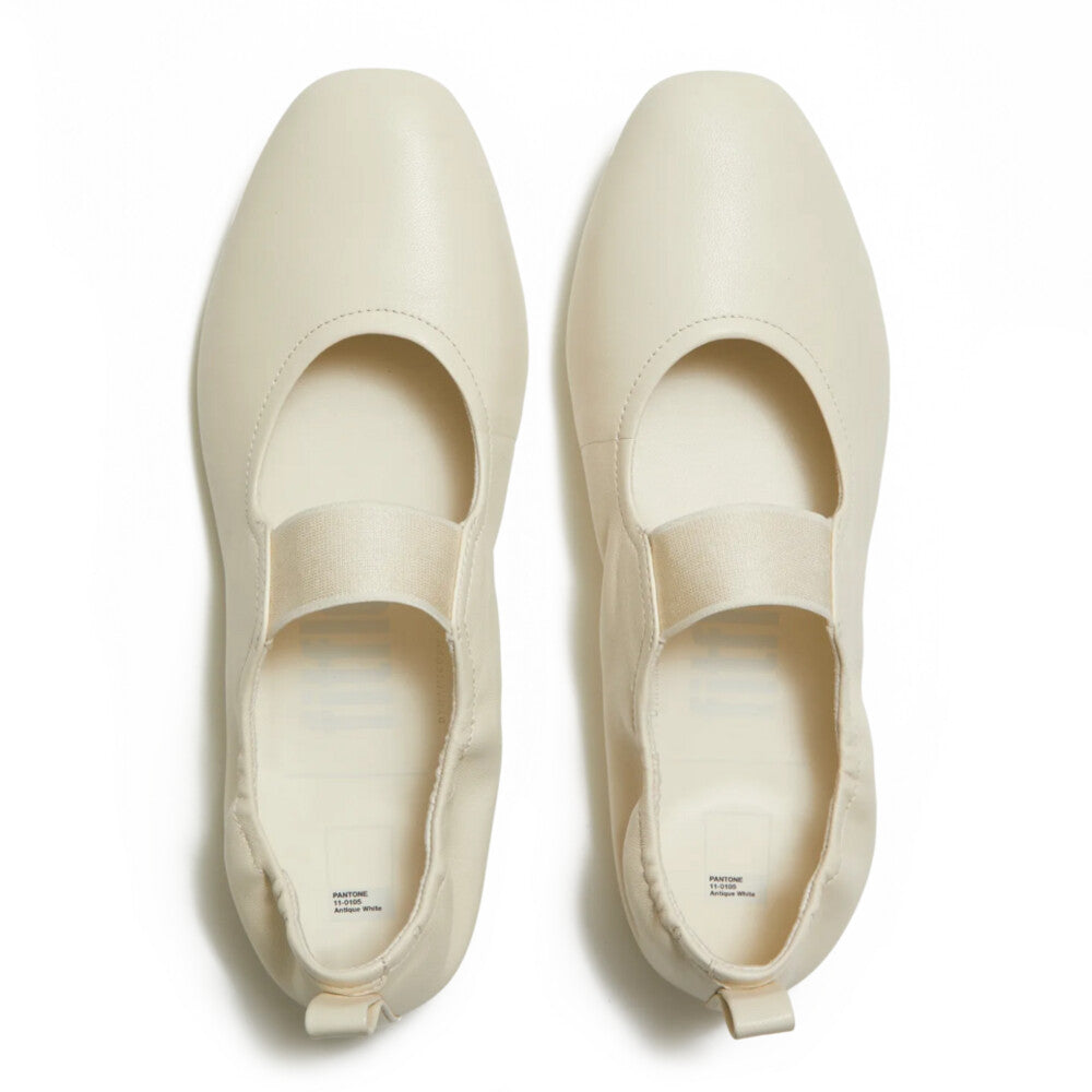
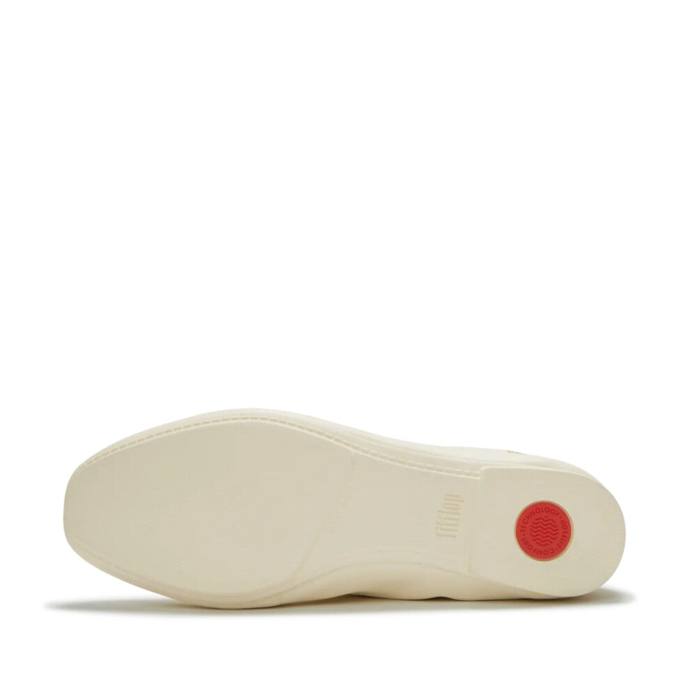
【FitFlop × Pantone】DELICATO HIGH BALLERINA - SOFT LEATHER - PANTONE

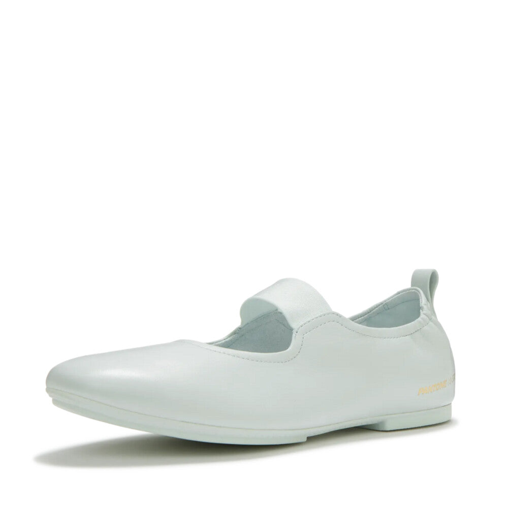
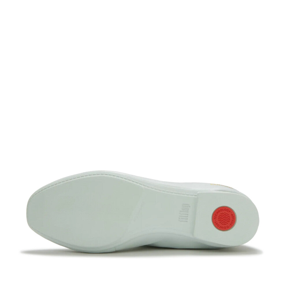
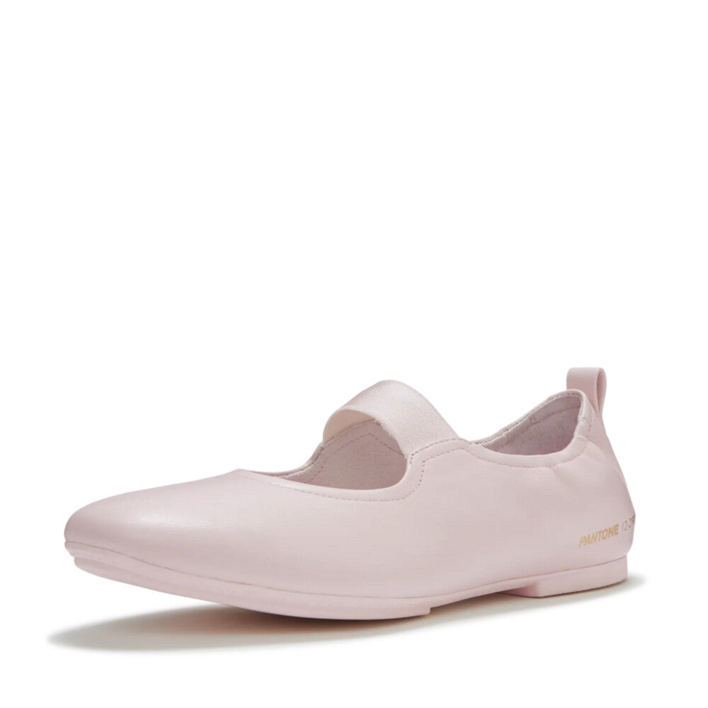
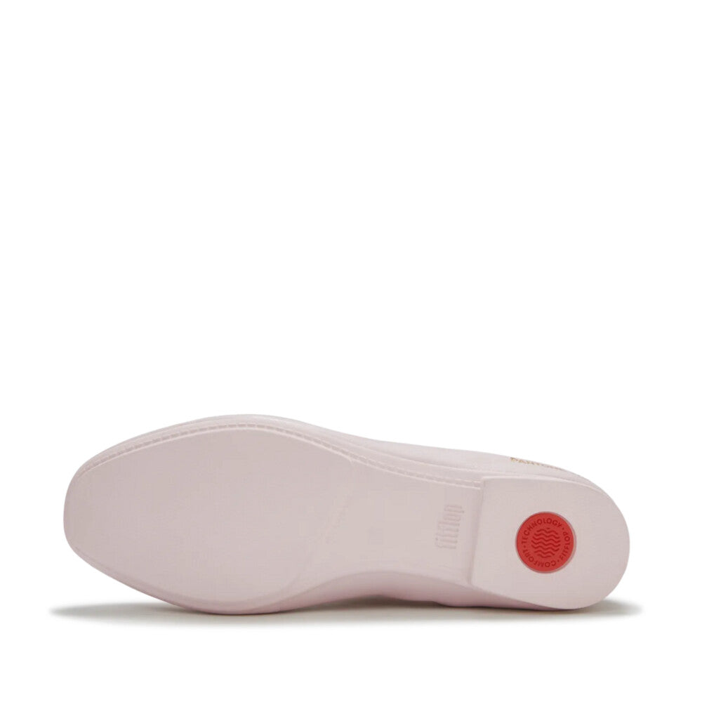
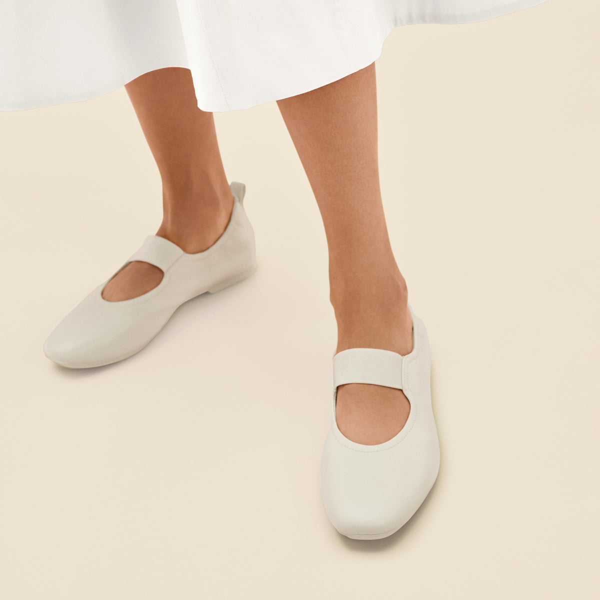
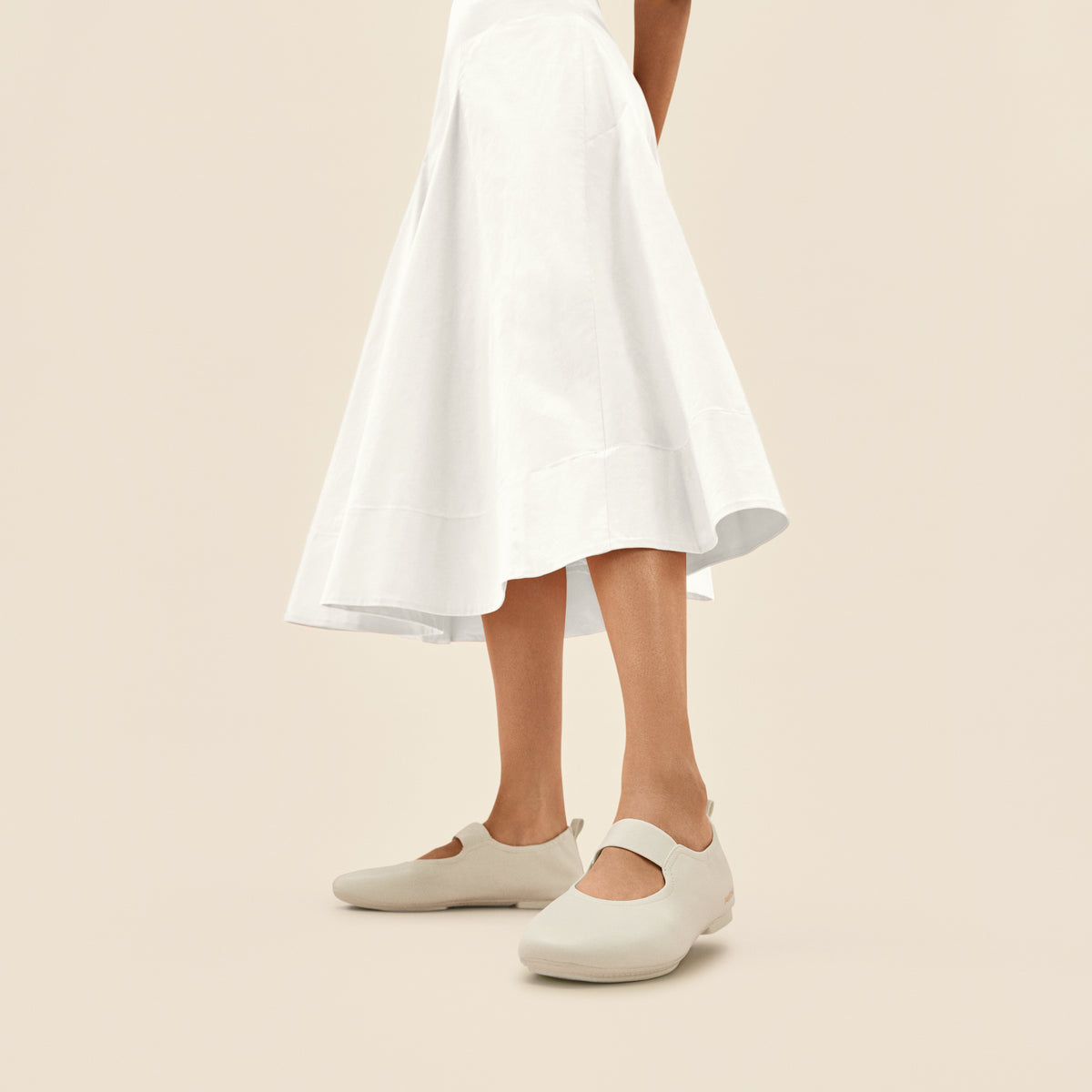
【FitFlop × Pantone】DELICATO ELASTICATED MARY JANE - SOFT LEATHER - PANTONE
色は、私たちの気分に影響を与える
最も強力なツールのひとつであり、
目で見るだけでなく
「心で感じる」ものでもあります。
FitFlopとのコラボレーションを通じて、
私たちは色彩の科学と心理学を、
非常に意図的なアプローチで
フットウェアへと落とし込みました。
それぞれの色合いは、軽やかさ、
心地よさ、そして感情の安らぎを
引き出すために選ばれており、
色が単なる視覚的要素を超えて、
踏み出す一歩一歩で
「身をもって感じられるもの」へと
変わり得ることを示しています。
Pantone Color Institute™副社長
ローリー・プレスマン

